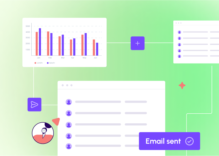
Email marketing is one of the marketing techniques with the highest potential for revenue - for every $1 you spend on email marketing, you can expect a return of $42. But that word “potential” is important - some email marketing campaigns will rake in the big bucks and others will flop. It largely depends on one thing: skillful and strategic email design.To thrive and cook up a campaign that’s worthwhile, you have to keep up with the ever-changing email design best practices. As long-standing experts in the email marketing field, we’re here to help. We’ve created this guide of the top email design best practices for 2023.
What is email design?
Email design is the development of an email through strategic designing that ultimately engages and resonates with your business’s target audience. Your email design should be eye-catching and optimized for all email subscribers. Effective email design can be the difference between an email that wastes away unread in inboxes and one that compels readers to click and make a purchase. At the risk of sounding dramatic, the revenue potential of a well-designed email is practically limitless.
Benefits of effective email design
Strong email design has the ability to significantly impact your email marketing metrics. An engaging, attention-grabbing email brings plenty of benefits to your business including:
- Increasing audience engagement and excitement
- Building brand awareness and recognition
- Establishing credibility with the audience
- Boosting conversion rates
Strong email design is a win-win, bringing your audience a more engaging and useful email and bringing your business more revenue. But how do you make your email design effective, exactly? Let’s dive into practical tips you can start using today.
Email Design Best Practices
Expert graphic design skills aren’t needed to create impactful email designs and templates, simply follow along with these best practices, and you’ll be on your way to reaping the benefits that we shared above.
Choose an Email Layout that Suits Your Email’s Goal
The way you lay out your email will depend on what type of message you’re sending. A transactional email, an email newsletter, and a DEM email (direct email marketing) are all very different, and your layout for each one should create a visual flow that leads readers toward the goal of that email.While every email’s layout will be unique, there are several common types of layouts that can each suit specific purposes and goals. These include:
- Inverted pyramid layouts
- Gutenberg diagram email layouts
- Z-pattern email layouts
- F-pattern email layouts
There’s no singular email layout that’s more effective than the others; it all depends on the situation and what you’re trying to accomplish. Let’s talk about each of these layout types and what they can do for your email design.
Inverted pyramid email layout
An inverted pyramid email uses an upside-down triangle as its guide: It grabs your attention with a broad headline, explains more with a few lines of copy and then narrows in on the main CTA. This MealPal email showcases an inverted pyramid layout.Subject line: STOP waiting in line and get 40% off

Gutenberg diagram email layout
The Gutenberg diagram divides your email layout into a grid with four sections — primary optical (top left), strong fallow area (top right), weak fallow area (bottom left) and terminal area (bottom right). People’s eyes generally move in this pattern as they read, so using the Gutenberg diagram can ensure your email is easy to skim.

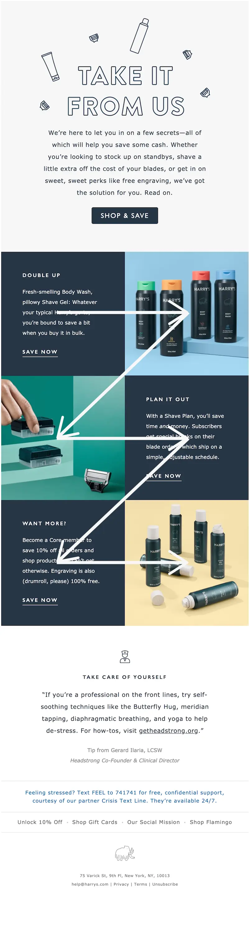
Z-pattern email layout
The Z-pattern email layout is effective because the zigzag pattern follows the path most readers’ eyes will take. Z-pattern messages are a great option for simple emails without much copy where you’d like to highlight the CTA. Here’s an example of a Z-pattern:Subject line: Load up on all your grooming essentials
F-pattern email layout
Another common scanning pattern is the F-pattern, in which readers’ eyes move across the page in the shape of an F. With this pattern, people tend to catch the top headline, any bullet points on the left side of the page, and subheadlines across the page.Subject line: New arrivals | Sets to love

Email layout is an essential step in email design best practices. Choosing the right layout can make an enormous difference in how likely your customers are to convert.
Additional Layout Tips
Here are a couple more tips to keep in mind as you consider your email layout options:
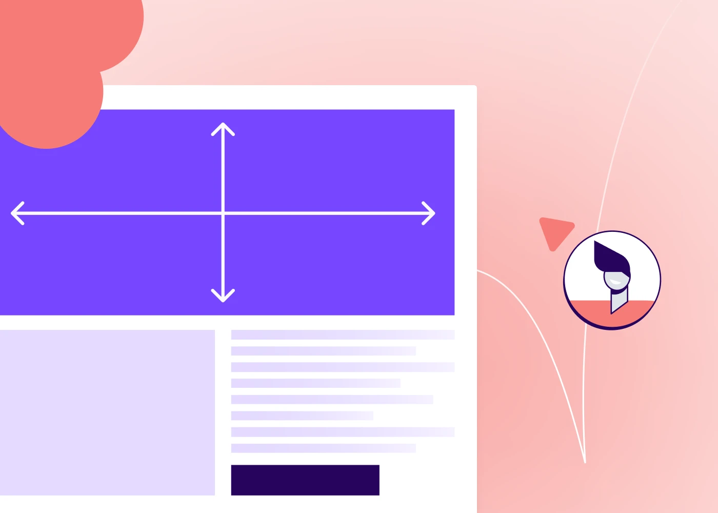
- Modular structure. An email with a modular structure is mobile responsive and adaptable. It ensures that recipients can view the message on any device.Pro Tip: Your email should also be no more than 600 pixels wide so people don’t have to scroll horizontally.
- Rule of three. Another way to keep your email layout simple and skimmable is to focus on three main email design elements.
Coordinate Each Element of Your Email Structure
Each element of your email’s structure will play a part in how effective your email design is. They need to all coordinate with each other to create the on-brand, compelling effect you want. Let’s look at each element in a well-structured email and how to optimize them.
Subject line and preheader
Your subject line is the bold title of your email that readers see in their inbox, and the preheader (AKA preview text) is the text readers see below or next to that bold subject line. Depending on the email program a reader is using, it will look something like this:

As you can see, the subject line and preheader are the only pieces of information (other than your name) that a user has when they decide whether to open the email. These pieces need to be enticing and clear, grabbing readers’ attention and giving them a reason to click. Think about who your audience is and what appeals to them most.
Body
The body text of your email should be engaging and personal, accurately representing your company’s personality and making a connection with the reader. Be clear about what you’re asking the reader to do and stay focused on your main message. Remember, your reader is bombarded with messaging all day every day. If you want to stand out in their memory, make your email body creative and relatable while keeping it concise and on-brand.
CTA
The header and body of your email should lead the reader straight to the CTA button. Create a sense of urgency if you’re having a sale, and prep a specific landing page for this CTA. When you design your CTA button, make sure it’s bulletproof so it will render correctly in any inbox.As much as possible, stay focused on the message you want to send with your CTAs. Multiple CTAs in an email can actually hurt your conversion rate — having too many choices is overwhelming. Think about your primary goal for conversion (is it most important to you that people visit your website or social media?) and use that as your CTA.Keep in mind that using descriptive CTA text instead of a generic phrase (“click here”) can encourage readers to act. Moleskine uses the words “Personalize now,” which helps the reader envision themselves purchasing the customized product.Subject line: Unique notes

Footer
For brands, an email footer usually includes social media links and the business’s physical address, as Groove Life does here. Solopreneurs or CEOs might craft their footer as more of an email signature with personal contact information. The footer of your email is also required by law to include a visible unsubscribe link.

Learn more helpful footer tips in our blog post outlining best practices for email footer design.
Be Strategic with Visual Design Elements
When the structure of your email is ready to go, it’s time to consider what design elements to include.
Typography
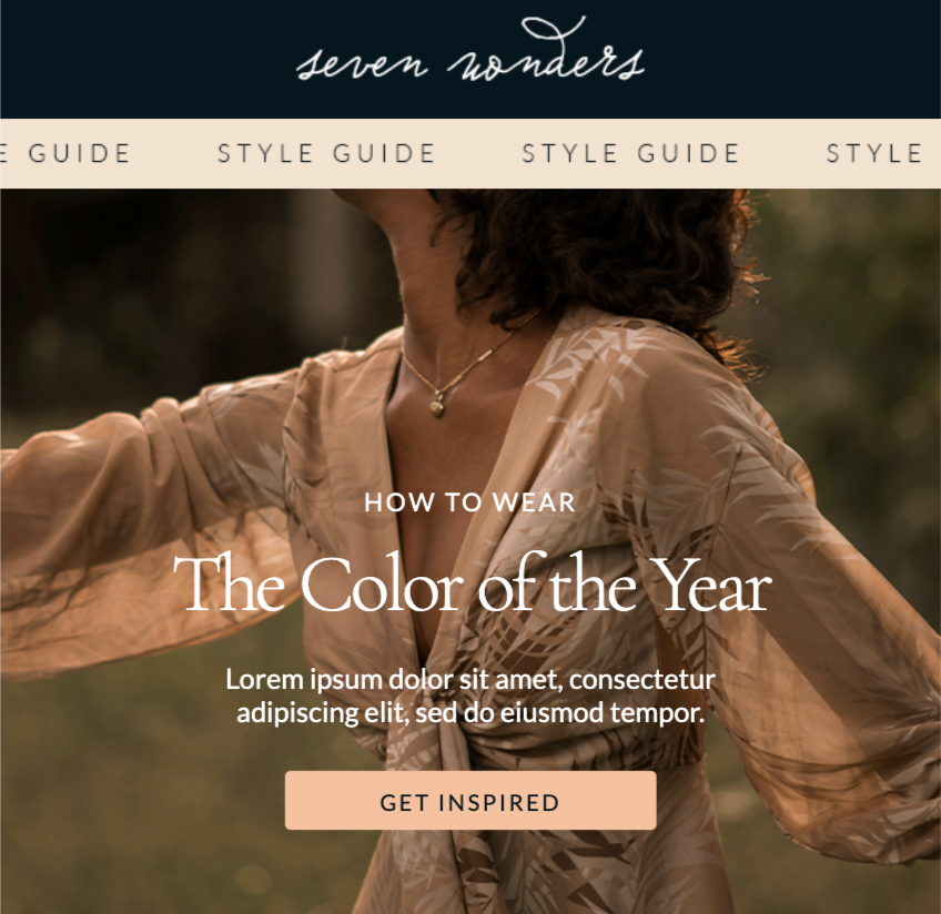
Typography is an important part of your company’s visual branding. For the body of your email, use a font that’s easy to read. Consider font color, spacing, and size. Don’t use more than two fonts in order to keep it on-brand so customers read it as professional. If you decide to use a custom font, make sure to preview the email on multiple devices. We love the simple but effective typography in this Tuft & Needle email.Subject line: Save 10% on new sheet covers

Color
Color is essential when it comes to how your customers view your brand. Use a non-white background color to make your email look like one cohesive image. Then choose accent colors (such as the shade of your header or CTA button color) based on your brand colors and the email’s overall color scheme. For example, MealPal uses a pale blue background and adds a pop of color with the orange CTAs (which match the company logo at the top).Subject line: NEW: groceries for 40% off with MealPal Market!

Animated content
GIFs and videos are popular when it comes to email design best practices. Animated GIFs can grab a reader’s attention with humor or they can demonstrate how to use your product. If you choose to include video in your emails, create educational content and post it on your website or YouTube. Many ESPs don’t allow videos to play in messages, so sharing the video link in the email is best.
Optimize Your Email Design
Your job doesn’t end once your email is structured and designed. You must also optimize your email settings, test your emails, and check that they are accessible to everyone.
Personalization
It’s natural for your customers to pay more attention to information that is more relevant to them, and you can signal that your email is relevant by personalizing the design. This doesn’t mean you have to hand-customize every email that goes out - there are ways to automate this in a practical way.You can use simple strategies like adding the customer’s name in the email and including suggested products in the email based on the customer’s purchase history. You can also create several versions of your email designed for different segments of customers, like one version for customers ages 18-30, another for those ages 30-45, another for those who are 45-60, and so on. Adjustments like these make your emails more personalized and relatable.
Responsive email template design
A responsive email template design ensures that your message will change size to be viewed on any device. Since nearly half of all email opens, take place on a mobile device like a smartphone, creating responsive emails is essential. Here at BEE, we have hundreds of responsive email templates that you can use to make sure your email design is mobile-first.
Test emails
Don’t send your email without testing it first to make sure you catch any mistakes. Testing your email can confirm whether your message is mobile-responsive. It also gives you a final chance to take in your color choices, images, and text all together. When you design with the Beefree, you can easily test your email when you’re through designing by sending it to yourself or previewing it on mobile (both found under the “Actions” tab in the upper left-hand corner of the editor). Most ESPs have built-in testing options too.
A/B test
In addition to testing your email with an internal review, consider running A/B tests where two groups of subscribers receive slightly different emails. By doing this, you can see which variations of the message get the highest open rates, conversions, and other performance metrics.A/B testing is a powerful strategy because no two audiences respond the same way to the same emails, so these tests can show you what works best for your specific audience. You can conduct A/B tests on nearly any element of your emails: the subject line, the preheader, the body, the CTA, and so on. Just be sure to only have one differing element in each A/B test so you know what caused one version to perform better than the other.
Accessibility
Many people consume online information in different ways due to varying physical, mental, or developmental abilities. For example, someone might use a screen reader that verbally reads the text on the screen. To make your emails accessible to everyone, use real text instead of images and structure the layout of your message so it’s simple and easy to read. Use these tips to ensure accessibility:
- Size all text to 14px or larger
- Add alt tags to your images to accommodate anyone who might not be able to see the photos or graphics; this text describes your images and is visible when the image cannot be shown (as shown in the image below).
- Keep your contrast high so it’s easy for readers to distinguish the elements of the messages. Who Can Use, a tool that shows you how people with visual impairments view different colors can be a huge help in making your emails accessible.
One other email accessibility best practice is to keep your image size small (around 600px). You don’t want your email to be too “heavy,” with large images that might not load on all devices and ESPs. Small images are best.
Enhance Inclusivity in Email Design
An inclusive email is one that takes into account the many ways in which your audience is diverse — from gender and race to ability, culture, age, and more. Your customer base isn’t made up of just one type of person, so your marketing emails shouldn’t address only one type, either. Do your photos show people of different races, genders and abilities? Does your language reflect the reader’s location and any potential cultural differences? If you’re not sure, find someone who can look over the emails and let you know. Your company can also focus on hiring people with diverse backgrounds to help create content that’s truly made for everybody.In addition to testing your email with an internal review, consider running A/B tests where two groups of subscribers receive slightly different emails. By doing this, you can see which variations of the message get the most opens.
Wrap-Up: Optimize Your Email Design With BEE Pro
Ready to create effective marketing emails? Try Beefree. Our thousands of drag-and-drop, customizable email templates can give you a launchpad. Or opt for a blank template to design your own email from the ground up — no coding knowledge required. Put the email design best practices you’ve learned into action and start designing today.
Share this post with your friends! Pin it on Pinterest ?

Editor’s Note: This post was updated on July 2023 to ensure accuracy and comprehensiveness.