
Design
Elevate Your Email Campaigns: Optimal Banner Size & Design Tips
Every marketer knows that branding, visually engaging branding, matters. In a recent HubSpot survey, 20% of marketers reported to see a direct correlation between their design choices and an increase in email engagement.
In email marketing specifically, one of the first design elements a recipient views is your banner, making it crucial to grab the attention of the reader at first glance. An email banner should effectively convey your message, resonate with your audience, and be responsive regardless of what device your recipient uses to view your emails.
Let's discuss email banner best practice to follow that will ultimately lead to improve results of your email campaigns.
What is an email banner?
An email banner is a strategic design element element that appears at the top of your emails to catch the immediate attention of your reader. Sometimes called an email header, your banner is where you’ll introduce the main purpose of your email, like that amazing sale you’re advertising or the product launch of the century, and reel in customers’ so they scroll through the rest of the email.
Your email banner is your chance to make a fantastic first impression. Let’s explore the best email banner sizes and best practices to keep in mind.
Ideal email banner sizes
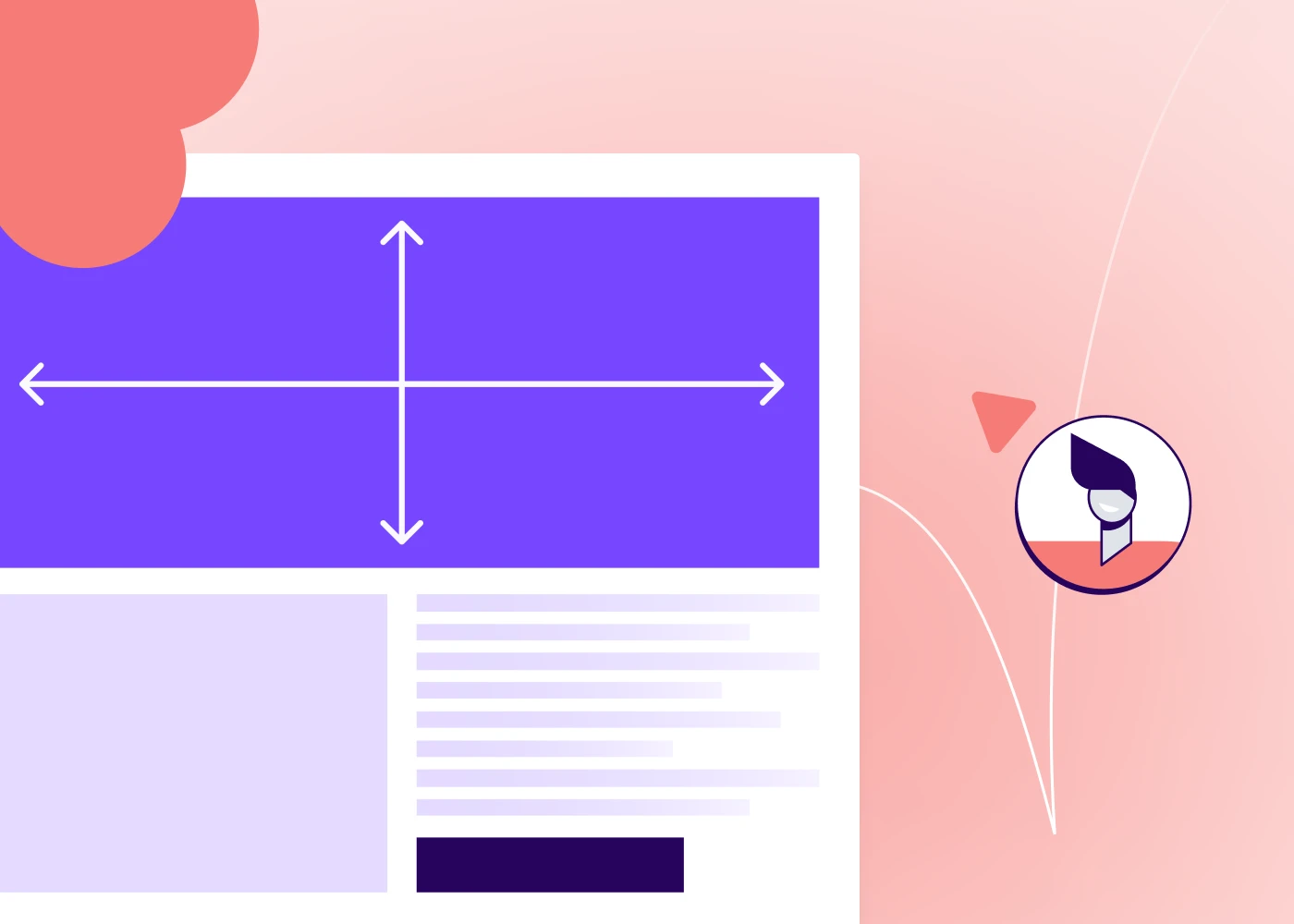
It is an outdated solution to automatically set all email banners to a width of 600px. With screen sized of both mobile and desktop devices varying so widely, it's important to ensure your email banner size is responsive for optimal viewing experience.
- For desktop users, a banner 650-700 pixels wide and 90-200 pixels tall is ideal
- For mobile users, the ideal banner is 350 pixels wide and up to 100 pixels tall
These updated dimensions follow responsive design best practices allowing email banners to render properly in a variety of email clients and devices.
Responsive design allows your email design to automatically adjust to the screen size of a customer’s device.
PRO tip: using an email design template that is already built to be responsive makes following this best practice a breeze.
Impact of email banner size on campaign performance
A banner that’s poorly sized could become distorted when customers open it in their Gmail, Outlook, or whatever email platform they use.
This makes your email look less professional and it can also be harder to read so it doesn’t get your message across as well. A poorly sized email banner can also affect the user experience. If the banner is too wide, for example, it forces customers to scroll horizontally and it doesn’t allow them to see the entire banner in one view.
Not only do these issues affect the overall experience customers have with your email but they can also squander the excellent engagement opportunity that a well-designed email banner can be. According to Opensense's data, email banners can have 5-10% engagement rates, a significant enhancement compared to the average click-through rate of 1.4% in emails.
Best practices for email banner design
Your banner size is an important part of designing an effective email banner, but it’s one of many. Check out these best practices to make your email banner even more powerful in garnering the engagement of your recipients.
- File size: Any image in your email, but specifically your email banner, should be of high-quality. The ideal image should be download as a PNG at a resolution of 72dpi at 40kb or below.
- Inverted pyramid: This "rule" in email design relates to adding the most important information at the top, working your way down to the least important information. When designing your email banner, make sure it clearly communicates the most important message in your email.
- Brand consistency: As important as it is that your email banner makes a positive impression and communicates the main purpose of your email, it also should align with your brand. Make sure the design uses your brand colors, logo, or other aspects that make it consistent with your brand’s visual identity.
- Text: Your banner needs to communicate your message, but less is more. Keep your copy sparse so it isn’t visually overwhelming and so the focus stays on your core intention. Ideally, 45-75 characters on a line is the sweet spot.
- Email-friendly fonts: Make sure you use email-safe fonts that render reliably on major email platforms.
- Accessibility: You want your banner’s message to reach as many customers as possible, and that includes customers with disabilities. Make sure to include accessibility features like using alt text so viewers with visual impairments can understand your message and using color combinations that viewers with color blindness can see.
- Interactivity: Your email banner doesn’t have to be just a plain image or text. Consider making it interactive, such as with a GIF or a video that grabs your viewers’ attention.
- Testing: You can follow all the rules for proper email banner size and design, but it’s still important to test it in action to make sure it shows up the way you want it to. Always send yourself a test email and see how that test email looks on different devices and platforms before you send it to your subscriber list.
For inspiration, check out these excellent email banners. This one from Beefree's template catalog clearly communicate the purpose of the email, remains consistent in branding throughout and plays with visual and text hierarchy to guide the reader's eye.
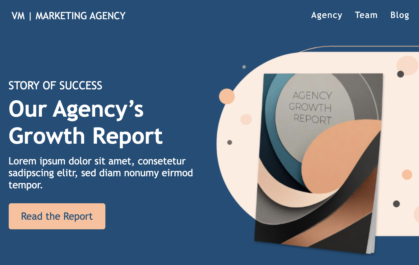
This other email banner uses a navigation bar to keep the reader in the brand's ecosystem allowing readers to learn more about the marketing agency. This simple, yet effective email header communicates clearly the purpose of the email using imagery and text and has a clear CTA to lead the reader to complete the desired action without needing to scroll.
Common mistakes in email banner design
When creating a strong email banner, it’s just as important to avoid doing the wrong things as it is to do the right things. Watch for these common pitfalls in email banner design:
- Over-designing: Your email banner is prime real estate in your email, so of course you want to make the best use of that real estate. If you try to cram too much into that banner, though, you may lose your core message entirely because viewers don’t know where to look.
- Hard-to-read fonts: Your email banner is a wonderful place to get creative and build visual appeal, so of course you want to use fun design elements and fonts.
But at the end of the day, the purpose is to send a message, so make sure the ornamental fonts you use are still clear enough that they’re easy to read.
- Lack of responsive design: We’ve touched on this above but it’s also a common misstep that’s worth mentioning. Considering that 46% of emails are opened on mobile devices, every email and banner you create must be responsive to maintain its visual quality on any email platform.
Leveraging Tools for Email Marketing Banner
There’s a lot to consider as you’re designing an email banner, but we have great news: there are tools that can make it easier.
Take Beefree for example. Our extensive email template library has over 1,700 pre-built templates that already use banner design best practices like responsive design, minimal text for maximum impact, and proper sizing. Our HTML email editor makes it easy to customize these designs for your brand and messaging.
Start designing with ease and sign up for a free account today!

60 Newsletter Ideas Readers Will Love + Free Email Templates
Newsletters are more than just digital letters; they're a bridge, connecting brands to their audience in the most personal way. In the vast sea of online content, creating a newsletter that stands out and resonates can be a challenge.
Dive into this blog, and you'll discover 60 captivating newsletter ideas that readers absolutely adore. Whether you're a seasoned newsletter professional or just starting out, we've got the inspiration to help you craft content that not only informs but also engages and inspires your audience. Let's get started!
Why are newsletters important?
Newsletters are like the unsung heroes of email marketing. Not only do they keep your audience informed and engaged, but they also play a pivotal role in building and nurturing relationships. Think of them as a regular touchpoint, a friendly "hello" that reminds your subscribers of your brand's value.
From sharing company updates to spotlighting new products, newsletters organize key information in a digestible format, ensuring your audience stays connected and in the loop. In essence, they're a bridge between your brand and its community, fostering trust and loyalty.
What to include in a newsletter
Crafting a newsletter? It's not just about filling space; it's about delivering value. The key is to provide content that resonates with your audience's interests and keeps them eagerly awaiting your next update.
For instance, if you're focusing on business, perhaps share some behind-the-scenes insights or company milestones. Looking for something light-hearted? Fun trivia or seasonal highlights might be your go-to. From monthly recaps to themed specials and educational deep-dives, the possibilities are vast.
Dive into this article, and you'll discover a treasure trove of newsletter ideas, whether you're in the mood for business insights, seasonal tidbits, or educational gems.
60 newsletter ideas to elevate your campaigns
So, you're on the hunt for newsletter content ideas that not only captivate but convert? You're in the right place! With a wide range of topics and themes at your fingertips, the challenge isn't about finding content—it's choosing which pieces of content to spotlight.
Whether you're aiming to inform, entertain, or inspire, the right idea can transform your newsletter from a mere email into a must-read. Dive into these 60 ideas, spanning business insights to themed wonders, and watch as your campaigns soar to new heights. Ready to elevate your email game? Let's dive in!
Interactive newsletter ideas
When it comes to newsletters, who said business can't mix with fun? Fun newsletters are the sprinkle of joy in your subscriber's inbox, offering a delightful break from the usual. They're not just about entertainment; they're about forging a deeper connection with your audience, showing the lighter side of your brand, and making your emails the ones they genuinely look forward to. Let's explore some ideas that'll infuse your campaigns with a dose of fun!
1. Trivia quizzes
There's something inherently engaging about quizzes. They challenge, entertain, and offer a moment of playful competition. Including trivia quizzes in your newsletter can boost engagement rates and encourage interaction. Plus, they're a fantastic way to highlight product features or company milestones in a fun manner.
We recommend initiating these emails with a direct and inquisitive questions about the topic. Not only does this challenges the recipient's knowledge but also establishes a personal connection, making them feel as if they're part of an exclusive inside joke only they know about.
2. Behind-the-scenes
Let your subscribers in on the backstage magic. Whether it's a sneak peek into your office culture, the making of a product, or a day in the life of your CEO, these glimpses humanize your brand and foster a sense of community.
3. Memes and GIFs galore
Who doesn't love a good meme or GIF? Incorporating these into your newsletters not only adds a touch of humor but also makes your content more relatable and shareable. It's a modern way to comment on current events or industry trends with a light-hearted twist.
4. Customer spotlights
Shine a light on your loyal customers. Share their stories, testimonials, or fun ways they use your product. It's a win-win: you get engaging content, and they get a moment in the spotlight.
5. Interactive polls
Engage your subscribers by seeking their opinions. Whether it's about a new product feature, industry trends, or just a fun "this or that" choice, polls can drive interaction and provide valuable insights.
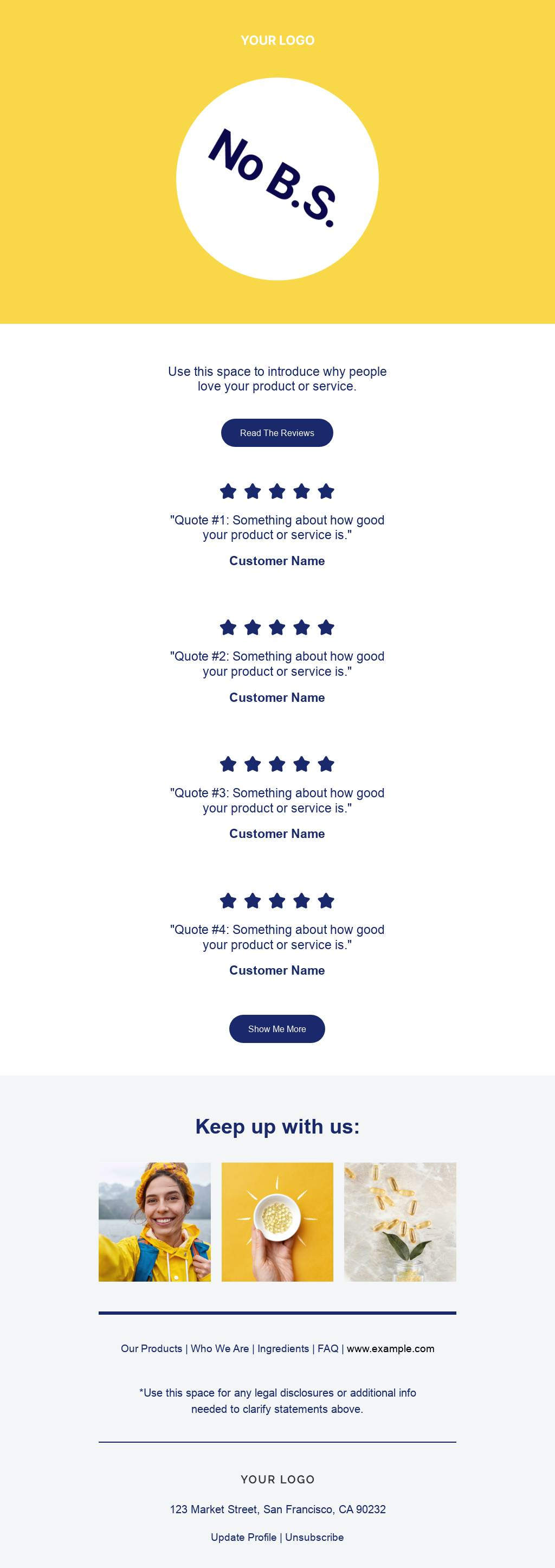
Dipping into newsletters like the one below, you'll see a masterclass in sparking customer interaction. Interactive polls not only spark email engagement, but it give your audience a voice, making them feel important and valued by your brand. Additionally, these emails are a goldmine for gathering genuine feedback about your offerings. It's a win-win: your subscribers feel heard, and you gain priceless insights. Talk about a conversation starter!
6. Themed playlists
Music connects people. Share themed playlists related to your industry, season, or just for fun. It's a way to set the mood and offer something extra to your subscribers.
7. DIY tips and hacks
Everyone loves a good hack. Share DIY tips related to your products or industry. It's not just informative but also showcases the versatility of what you offer.
8. Jokes and puns
A little humor goes a long way. Share industry-specific jokes or puns that resonate with your audience. It's a simple way to bring a smile to your subscribers' faces while building a bond and brand recognition! If you want to go beyond using funny email copy, consider offering a pun-y sale to go along with the joke. Now that's how you serve up a memorable newsletter!
9. Virtual scavenger hunts
Engage your subscribers with a virtual scavenger hunt. Hide clues in your website or social media channels and let them embark on a digital adventure. It's interactive and can be a unique way to highlight features or products.
10. Caption contests
Challenge your subscribers' creativity with a caption contest. Share an intriguing image and ask them to come up with a witty or humorous caption. It's interactive, fun, and can lead to some hilarious results. These types of newsletter ignite a two-way conversation between your brand and customers. By weaving in a playful caption contest, you're not only keeping subscribers engaged, turning passive readers into active participants.
Business newsletter ideas
Navigating the business world requires a blend of strategy, insight, and communication. Business newsletters serve as a bridge, connecting your brand with clients, stakeholders, and employees. They're not just about sharing updates; they're about showcasing your brand's journey, achievements, and vision.
Whether you're celebrating milestones, introducing new initiatives, or sharing industry insights, these newsletters position your brand as a thought leader. Let's explore some ideas that'll infuse your campaigns with professionalism and purpose.
11. Company milestones
Celebrating achievements, big or small, fosters a sense of pride and community. Sharing these moments in your newsletter not only keeps your audience informed but also builds trust and showcases growth.

12. Employee spotlights
Your team is the backbone of your business. Highlighting their stories, achievements, or unique skills humanizes your brand and showcases the talent behind the scenes.
This employee spotlight newsletter is a stellar example of how businesses can really humanize their brand. By highlighting new employees and their roles, they are setting the tone for collaboration and building a company culture of acknowledgment. It's not just about showcasing numbers and achievements; it's about celebrating the individual and showing that there's a genuine people behind the impressive work they will go on to do. This not only fosters a sense of community and camaraderie within the company but also strengthens trust and connection across teams.
13. Case studies
Showcase real-world applications of your products or services. Case studies provide tangible proof of your brand's impact and can drive conversions.
14. Upcoming events
Whether it's a webinar, product launch, or networking event, keep your audience in the loop. It drives engagement and offers opportunities for face-to-face interactions.
15. Industry trends
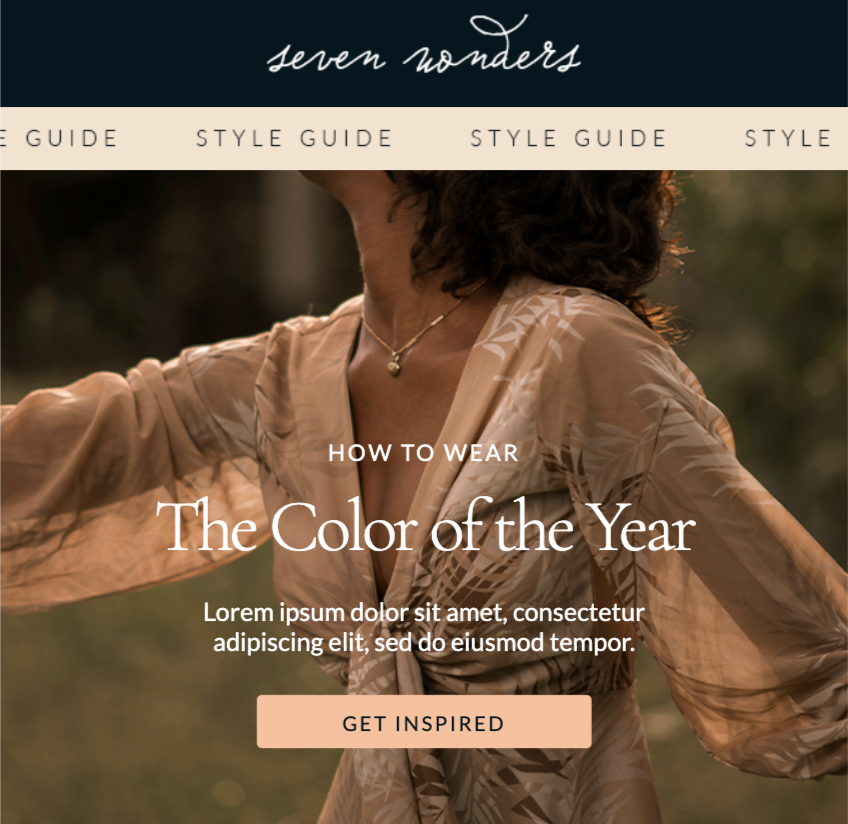
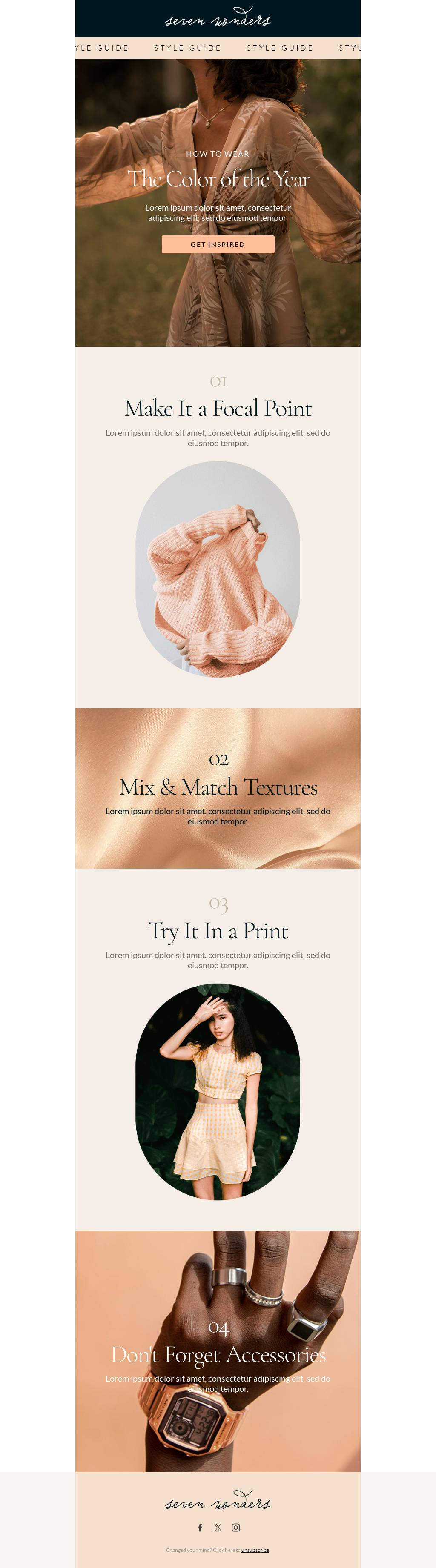
Stay ahead of the curve by sharing the latest industry trends and insights. It positions your brand as a knowledgeable player and provides value to your subscribers. The following template showcases the most recent Color of The Year as it relates to this fashion brand.
16. Product updates
Keep your subscribers informed about the latest features, improvements, or launches. It's a way to drive excitement and showcase continuous innovation.

17. Testimonials and reviews
Word of mouth is powerful. Share genuine testimonials or reviews to build trust and showcase the positive impact of your brand.
By spotlighting endorsements from customer who know the ins and outs of your offer, you can brilliantly broadcast the wide-reaching wonders of your product. Pair each testimonial with a candid snapshot to add an additional a personal touch, making the brand feel less like a distant entity and more like a trusted friend sharing success stories.
18. Business tips and advice
Share valuable advice or tips related to your industry. It positions your brand as a helpful resource and can drive engagement.
19. Expert interviews
Bring in industry experts for interviews or guest posts. It provides fresh perspectives and boosts your newsletter's credibility.
20. CSR initiatives
Showcase your brand's commitment to social responsibility. Sharing CSR initiatives resonates with ethically-minded subscribers and highlights your brand's values.
Monthly newsletter ideas
Consistency is key in communication, and monthly newsletters are the embodiment of that principle. Serving as a regular touchpoint, they offer a curated snapshot of the past month's highlights, ensuring your audience stays informed and engaged. Whether you're recapping events, sharing insights, or previewing what's on the horizon, monthly newsletters are a reliable way to maintain a steady connection with your subscribers. Let's delve into some ideas that'll make your monthly updates eagerly anticipated.
21. Monthly recaps
Think of monthly recaps as your brand's highlight reel, capturing all the noteworthy moments, wins, and stories from the past 30 days. It's like giving your subscribers a VIP pass, ensuring they're always in the loop and never miss a beat. Picture this: a vibrant timeline dotted with key events, achievements, and news, making your subscribers feel like they've been right there with you every step of the way.
22. Featured blog posts
Highlight the top-performing or most insightful blog posts from the past month. It drives traffic to your website and offers added value to your readers.
23. Customer of the month
Celebrate a loyal customer by sharing their story or experience with your brand. It fosters community and showcases real-world brand interactions.
24. Monthly poll results
If you run regular polls or surveys, share the results. It's a way to show subscribers that their opinions matter and provide insights into popular opinions or trends.
25. Upcoming promotions
Give your subscribers a heads-up about any special deals, discounts, or promotions coming up in the next month. It builds anticipation and can drive sales.
26. Spotlight on success stories
Dive into the transformative journeys of your customers or clients. Each month, highlight a success story that showcases the real-world impact of your product or service. Share challenges faced, solutions provided, and the outcomes achieved.
27. Monthly challenges
Engage your subscribers with a fun challenge or goal for the upcoming month. It can be related to your product, industry trends, or just for fun.
28. Voices from the community
Dive into the conversations happening around your brand. Each month, curate a mix of shout-outs, stories, and feedback from your community, whether it's on social media, forums, or direct messages. It's a way to show you're listening and value every voice.
29. Sneak peeks
Offer a glimpse into any upcoming product launches, events, or initiatives. It builds excitement and keeps your audience in the loop.
30. A personal note
Add a personal touch by including a note from the CEO or a team leader. It humanizes the brand and fosters a deeper connection with the audience.
Seasonal newsletter ideas
As the seasons change, so do the interests and needs of your audience. Seasonal newsletters tap into the current mood, offering content that's timely, relevant, and resonates with the spirit of the season. Whether it's the festive cheer of the holidays, the rejuvenation of spring, or the warmth of summer, these newsletters capture the essence of the moment. Let's dive into some ideas that'll make your seasonal newsletters a breath of fresh air in any inbox.
31. Holiday gift guides
During the festive season, everyone's on the lookout for the perfect gift. Curate a list of top products or services that make for great presents, tailored to your audience's preferences.

32. Seasonal recipes
Share recipes that highlight the flavors of the season. Whether it's a summer smoothie or a winter stew, it's a tasty way to engage your subscribers.
33. Seasonal DIY projects
Engage the crafty side of your subscribers with DIY projects that align with the current season. It's a fun and interactive way to celebrate the time of year.
34. Seasonal discounts and promotions
Offer special deals or promotions that celebrate the season. It's a timely incentive that can drive sales and engagement.
35. Event recaps
If your brand hosts or attends seasonal events, share a recap with highlights, photos, and key takeaways.
36. Seasonal trends
Highlight trends or popular items for the upcoming season. It keeps your subscribers in the know and positions your brand as a trendsetter.
37. Fundraising initiatives
During seasons of giving, showcase any charitable initiatives or partnerships your brand is involved in. It resonates with the spirit of the season and highlights your brand's values.

38. Seasonal challenges
Engage your subscribers with challenges that align with the season, whether it's a winter fitness challenge or a spring cleaning spree.
39. Decor and styling tips
Share tips on how to style clothes, homes, offices, or events in line with the season's theme. It's a creative way to immerse in the seasonal vibe.

40. A personal seasonal note
Add a personal touch with a note reflecting on the season, sharing personal stories, or looking forward to upcoming events.
Themed newsletter ideas
Themes can be the creative spark that ignites interest in your newsletters. They offer a cohesive narrative, making your content more engaging and memorable. Whether it's celebrating a global event, tapping into pop culture, or exploring a specific topic in-depth, themed newsletters stand out in an inbox and offer a fresh perspective. Let's explore some ideas that'll give your newsletters that thematic flair.
41. Cultural celebrations
Celebrate global events or cultural festivals, showcasing diversity and inclusivity. It's a way to educate and engage subscribers about different traditions and customs.

42. Pop culture moments
Tap into trending pop culture moments, whether it's a hit TV show, a viral meme, or a blockbuster movie. It makes your content timely and relatable.
43. Historical throwbacks
Take a trip down memory lane by highlighting significant historical events or milestones related to your industry or brand.
44. Eco-friendly focus
Dedicate a newsletter to sustainability and eco-friendly practices. It's a way to showcase your brand's commitment to the environment and offer green tips.
45. Tech and innovations
Highlight the latest tech trends, innovations, or gadgets related to your industry. It positions your brand as forward-thinking and in-the-know.
46. Book or movie recommendations
Share curated lists of books or movies related to your industry, season, or any theme. It offers added value and positions your brand as a curator of good content.
47. Art and creativity
Celebrate the world of art, design, and creativity. Showcase artists, design trends, or creative projects that inspire.
48. Travel and exploration
Take your subscribers on a virtual journey, exploring destinations, cultures, or travel tips. It's a way to inspire wanderlust and share unique experiences.
49. Health and wellness
Focus on well-being, sharing health tips, recipes, or fitness challenges. It's a way to promote a balanced lifestyle and offer valuable advice.
50. Hobby and passion projects
Highlight hobbies or passion projects, encouraging subscribers to explore new interests or dive deeper into existing ones.
Educational newsletter ideas
Knowledge is power, and educational newsletters are the torchbearers of that power. They serve as a platform to enlighten, inform, and provide value to your subscribers. Whether you're breaking down complex topics, sharing industry insights, or offering tutorials, these newsletters position your brand as a trusted educator. Let's explore some ideas that'll make your newsletters a treasure trove of knowledge.
51. Industry deep dives
Offer in-depth analysis or insights into specific industry topics, trends, or challenges. It establishes your brand as an authority and provides valuable content to your subscribers.
52. How-to guides and tutorials
Break down processes or tasks with step-by-step guides. It's a practical way to offer hands-on knowledge and assist subscribers in mastering new skills.
53. FAQ sessions
Address common questions or misconceptions related to your industry or product. It's a way to clarify doubts and offer direct value.
54. Webinar recaps
If you host webinars or online sessions, share key takeaways, highlights, or recordings. It extends the reach of your content and offers a recap for attendees.
55. Research and studies
Share the latest research, studies, or surveys related to your industry. It keeps your subscribers updated and offers data-driven insights.
56. Guest expert columns
Invite industry experts or thought leaders to contribute to your newsletter. It offers fresh perspectives and boosts the credibility of your content.
57. Book summaries or reviews
Offer summaries or reviews of influential books related to your industry. It's a way to promote continuous learning and offer reading recommendations.

58. Interactive quizzes
Test your subscribers' knowledge with interactive quizzes related to your industry or recent content. It's engaging and offers a fun learning experience.
59. Resource roundups
Curate a list of valuable resources, tools, or articles that can benefit your subscribers. It's a way to offer added value and save them research time.
60. Learning challenges
Encourage continuous learning by introducing monthly or weekly learning challenges. It can be related to a skill, topic, or habit.
Bring your newsletter ideas to life with Beefree
We've journeyed through a galaxy of ideas for a newsletter, from the fun-filled to the educational, and from the seasonal to the thematic. But, as we all know, even the most captivating content needs a stellar design to truly shine. That's where Beefree steps in. With Beefree’s intuitive email editor, you can effortlessly pair your top-notch content with equally impressive designs, ensuring your newsletters aren't just read, but remembered.
Whether you're crafting a monthly recap or diving deep into industry insights, Beefree ensures your vision translates perfectly into the inbox. With customizable templates, user-friendly tools, and a plethora of design options, you're equipped to create newsletters that resonate, engage, and inspire.
Ready to elevate your newsletter topic game? Dive into Beefree for a world of design possibilities. Get started with a free account and let's make your next newsletter one readers will love!

Color of the Year 2024: What It Is and How to Harness It in Email Marketing
This year, Pantone celebrates its 25th year of its unique and inspiring Color of the Year program. While many people find the Color of the Year to be simply an entertaining announcement, for marketers, this color can be a gateway toward better connecting with your customers and audiences.
Let's discuss how email marketing pros can stay ahead of the trends and effortlessly infuse the Color of the Year 2024 in your email campaigns.
What Is the Color of the Year 2024?
Each year, Pantone selects a "Color of The Year" that depicts and illustrates the state of the current culture and recent trends. This year's color is Peach Fuzz, Pantone 13-1023.

According to Pantone's reasoning for selecting the color Peach Fuzz, they state that it serves as an expression of the kindness, tenderness, warmth and togetherness that our culture is seeking and driving for in 2024. As Pantone explains, “Pantone 13-1023 Peach Fuzz captures our desire to nurture ourselves and others. It’s a velvety gentle peach tone whose all-embracing spirit enriches mind, body, and soul.” For many, this color embodies a vintage feel, creating a sense of honoring the past while welcoming the opportunities of the future.
How is the Color of the Year chosen?
For Pantone, choosing the Color of the Year is a long and comprehensive effort. Its team of color experts is continuously at work observing the global culture and the expressions of color across fashion, art and design, lifestyles, travel destinations, imagery on media platforms, and so on.
The Color of the Year is both an expression of our present culture at the dawn of a new year and a result of trend forecasting for colors, attitudes, and social movements that will be pervasive in the year ahead. It’s decided by the emerging popularity of the color itself as well as the emotions and concepts associated with the color.
Why does the Color of the Year matter in email marketing?
The Color of the Year can be an excellent asset to your email marketing (and your other 2024 marketing channels) in multiple ways. First, this color is representative of the present culture, which means it’s likely relatable to your present-day audience. It embodies a mindset that your consumers are likely to share - one of warmth, wellness, and interpersonal kindness - which fosters the connection between your brand and the consumers.
Second, the Color of the Year is in keeping with current color and fashion trends. By incorporating this color into your email marketing, your brand looks to be trendy and up-to-date. Even if consumers don’t know what the Color of the Year is, they notice that your emails have a modern, on-trend look.
Ways to use the Color of the Year 2024 in your email marketing
As we step into the vibrant realm of 2024, the Color of the Year takes center stage as a powerful tool for marketers seeking to infuse their strategies with contemporary flair.It serves as a language of its own, capable of communicating emotions, evoking reactions, and establishing a unique visual identity for brands. By incorporating the Color of the Year into marketing initiatives, businesses can align themselves consumer sensibilities, fostering a connection and positioning themselves as forward-thinking.
Use imagery with the Color of the Year 2024
Peach Fuzz doesn’t have to be the core color of your email design for you to benefit from it. When selecting images to include in your
email campaigns, consider looking for images that have Peach Fuzz or a similar color. For example, this royalty-free images from Unsplash each contain peachy hues that have the same mood and essence as the Color of the Year 2024. You’ll notice that the color isn't too prominent, but still stands out and plays well with the other colors in the image. This is a great depiction how you can incorporate Peach Fuzz to pair well with your brand identity.

Align your messaging with the Color of the Year 2024
As we’ve noted, the Color of the Year isn’t just a color; it’s a concept and an embodiment of our culture. You can use this to inform the messaging in your email marketing. In the case of Peach Fuzz, infuse your messaging with a sense of kindness, compassion, and warmth to speak to our current culture and appeal to your audience’s mindset in the present time.
Add the Color of The Year to your seasonal and trendy campaigns
By infusing the Color of the Year into seasonal and trendy campaigns, you not only stay relevant and timely but also capitalize on the cultural and emotional resonances associated with the chosen color, creating a dynamic and engaging experience for your audience. Here are some ideas:
Align the color with changing seasons
Embrace the changing seasons and incorporate the Color of the Year into your email campaigns that align with specific times of the year.

Capitalize on fashion and design trends
Stay attuned to fashion and design trends that feature the Color of the Year. Incorporate the color into email campaigns that showcase how your products or services align with current style preferences. Additionally, highlight new arrivals or product collections that prominently feature the trending color, catering to the fashion-forward interests of your audience, such as the template below:

Create a sense of urgency and exclusivity
Create a sense of urgency and exclusivity by tying the Color of the Year to limited-time promotions or exclusive offers. Use the color to highlight special discounts, early access to products, or exclusive content, encouraging your audience to engage promptly with your email campaigns.
Develop themed content and storytelling
Develop themed content around the Color of the Year, telling a story that resonates with your brand and the significance of the color. The email template below serves as a perfect starting point to share share narratives, testimonials, or behind-the-scenes content that emphasizes the emotional and cultural aspects associated with the color of the year.

Does the 2024 Color of the Year suit your brand?
Evaluating whether the 2024 Color of the Year suits your brand involves a nuanced exploration of the color's characteristics and your brand identity. Begin by examining the psychological and emotional associations of the chosen color. Peach Fuzz has a warm, welcoming, and peaceful air that can align well with many brands’ voices and messaging. Consider the values, personality, and messaging of your brand; does the color align with these elements, or does it pose a potential contrast that could enhance visual appeal and captivate your audience?
If the color resonates with your target demographic and aligns with your brand's narrative, it may offer an opportunity to play around your visual identity. However, remember that a balance between staying on-trend and maintaining a unique brand identity is crucial.
Strengthening your 2024 email marketing with the Color of the Year
Embracing the Color of the Year in your email campaigns is more than just a visual choice; it's an opportunity to remain competitive and provide users with something new. By strategically incorporating the Color of the Year, you can create visually appealing and emotionally resonant emails that stand out in crowded inboxes.
The easiest way to experiment with the color of the year in email campaigns is to start with a pre-designed template. Beefree’s "Color of The Year" template collection is a perfect place to start. Our user-friendly email editor makes it easy to customize all templates with your brand identity and effortlessly make a few simple changes to bring Peach Fuzz into your design.


How To Utilize Gamification For Your Next Email Marketing Campaign
Today, digital interactions dominate, and gamification has emerged as a powerful tool to capture and maintain audience attention. More than 70% of businesses included in the Global 2000 have adopted gamification as a key strategy.
In this article, we'll explore the significance of gamification in email marketing, understand its core concepts, delve into the psychology behind it, and provide insights on implementing and overcoming challenges in your gamified campaigns.
The psychology behind gamification in email
At its core, gamification in email marketing revolves around incorporating game-like elements to enhance user engagement.
This strategy involves understanding human behavior and motivation and leverages the psychological aspects that make games inherently appealing, such as competition, achievement, and rewards. Together, these insights help email marketers determine the best use of gamification to help drive engagement and shape consumer responses.
Here are the 3 key psychological drivers in gamification:
Intrinsic motivation
Gamification triggers users' desire to participate by incorporating challenges, rewards, and competitions. As a result, this creates a sense of achievement in users brought on by the idea of "winning" and reinforces positive engagement.
Operant conditioning
By strategically designing gamified elements that reward specific actions, marketers create a positive association between user engagement and valuable incentives. This conditioning strengthens the likelihood of users repeating desired behaviors, establishing a cycle of ongoing engagement.
Cognitive biases
Leveraging cognitive biases like scarcity bias allows marketers to prompt quicker responses by offering exclusive rewards or limited-time promotions.
In short, by appealing to individuals' inherent need for achievement and recognition, gamification becomes a powerful tool for capturing and maintaining their attention.
How to use gamification in email marketing
The concept of rewards and incentives helps amplifies the gamification strategy. Offering tangible benefits like exclusive discounts or access entices users to not only engage with emails but also to seek out additional interactions. Let's delve deeper into how you can use gamification to create a competitive edge and engage users in your next email campaign:
- Points, Badges, and Leaderboards: Creating a competitive edge by rewarding users with points, badges, or leaderboard positions based on their interactions with your emails. This not only helps promote a feeling of accomplishment in users, but also helps foster a sense of community and competitiveness that leads them to climb leaderboards and stand out.
- Rewards and Incentives: Offering tangible benefits such as discounts, exclusive access, or special promotions to incentivize user participation. This exclusivity makes users feel valued and special, fostering a stronger connection with your brand.
- Interactive Elements: Enhancing user experience by introducing interactive features like quizzes, polls, or challenges within email content. These elements not only enhances engagement but also provides valuable insights into customer preferences, helping you tailor future content and offerings.
By tapping into users' motivations, whether it be competition, a desire for recognition, or the pursuit of exclusive benefits, you can create dynamic emails that help build a loyal and active audience for your brand.
Benefits of gamification in email marketing
Gamification transforms the user experience from a passive act of scrolling through emails into an interactive and dynamic journey where each click or purchase brings them closer to a tangible reward.
Increased customer engagement:
By turning the email experience into a game-like, subscribers are encouraged to engage with the content, spending more time exploring and interacting with the messages. This heightened engagement not only improves the chances of users absorbing the information presented but also creates a memorable and enjoyable experience, setting the brand apart in the minds of the recipients.
Enhanced brand loyalty:
One of the significant benefits of gamification is its ability to create deeper connections between a brand and its audience. When users consistently engage with gamified email content, they become active participants in a brand experience, leading to stronger brand-customer relationships and increased loyalty.
Higher conversion rates:
Gamification can be a powerful motivator for users to take desired actions. Whether purchasing, sharing content, or subscribing to newsletters, the gamified elements provide incentives and rewards for these actions. This motivational aspect drives increased participation, as users are more inclined to interact with emails, complete tasks, and actively engage with the brand, contributing to a more dynamic and participatory audience.
Improved data collection and analytics:
Gamification allows valuable user data collection through interactions and participation. Users willingly provide information while engaging with challenges, quizzes, or other gamified elements. This enriches your customer database and provides insights into user preferences and behavior. Improved analytics enable marketers to tailor future campaigns based on a better understanding of their audience.
5 Best practices for using gamification in email marketing
Embarking on a successful gamified email marketing campaign requires meticulous planning and strategic considerations. The following strategies and tactics can transform your email campaigns into immersive and rewarding journeys, making a lasting impression on your audience and optimizing your marketing efforts.
- Define campaign objectives: Clearly outline the goals of your gamified campaign to align with your overall marketing strategy. Use data-driven insights to identify the objectives and strategy for your emails. This means regularly tracking key metrics such as open rates and click-through rates. Once your campaigns launch, assess the effectiveness of your gamification elements to refine future campaigns.
- Identify target audience: Personalization is key to creating a more engaging experience. Understand your audience's preferences and tailor gamification elements to their interests. By leveraging data and what you know about your unique audiences, you can create better segmented gamified content that tailors to individual preferences. This includes personalizing challenges, rewards, and interactions, making the entire experience more relevant and appealing to different audiences.
- Choose appropriate gamification elements: Select elements that resonate with your brand and align with customer preferences. Ensure rewards align with audience interests. Go beyond generic incentives by offering enticing and meaningful rewards such as exclusive discounts, early access, or special promotions. It is crucial to adhere to data protection laws, like GDPR and CCPA, in your gamification practices. Communicate clearly how user data will be used and ensure compliance to build trust with your audience.
- Integrate gamification into email design: Ensure a smooth transition to gamified content for an intuitive and enjoyable experience. This means visually appealing emails with a user-friendly interface that offers a seamless transition from the email to the gamified elements.
- Develop clear calls-to-action (CTAs): Encourage user participation by crafting compelling CTAs that drive desired actions. Clearly communicate what action you want the user to take and highlight the benefits of doing so. Whether it's clicking a link, participating in a challenge, or making a purchase, the CTA should be persuasive and aligned with the gamification goals.
Overcoming challenges in gamified email marketing
When using gamification in email, it is important to find the right balance between gamification elements and the core message of the email. It's essential to integrate gamified features seamlessly without overwhelming or distracting recipients from the primary content. This lack of harmony brings forth two main challenges:
User fatigue
With the increasing use of gamification in various digital platforms, users risk experiencing fatigue or disinterest in engaging with gamified content. If not managed carefully, this fatigue can decrease overall participation and effectiveness.
Mitigation Strategy: To counter this, marketers should introduce variety and novelty in gamified content, keeping users engaged with fresh challenges and incentives. A/B testing is a great way to experiment with different gamification elements to identify what resonates best with your specific audience.
Lack of brand recognition
Maintaining consistency and alignment with your brand image while implementing gamification can be challenging. If gamified elements feel disconnected or misaligned with your brand identity, it may create confusion or a lack of authenticity among your audience.
Mitigation Strategy: Regularly analyze performance metrics and gather user insight to continuously improve your gamification strategy. Actively seeking insights from your audience about their preferences and perceptions allows you to adapt and iterate on your gamified content.
Unleashing the power of email gamification with Beefree
In an era where consumer attention is a prized commodity, the integration of gamification has emerged as a dynamic strategy to captivate and engage audiences within the realm of email marketing. It's important to remember that the essence of success in this area is rooted in persistent experimentation and creative thinking. Embrace the opportunity to try fresh gamification techniques in your email campaigns to maintain a competitive edge.
No-code solutions like Beefree simplify this process by providing an intuitive and user-friendly solution that empower marketers to seamlessly incorporate interactive and gamified elements into their email designs.
So, create a free account and start infusing some fun and interactivity into your email marketing efforts. Here's to the exciting gamification journey – may it bring you great results and enjoyment!

Innovative Leap Day Email Marketing Ideas for 2024
We have a unique holiday on the horizon that doesn’t come around often: Leap Day. This special occasion only comes up every four years, and it’s simply a fun and quirky holiday that your customers enjoy celebrating. Getting in on the fun with them is an excellent way to connect with your customers through a shared experience.
But how? Explore these creative ideas for Leap Day email marketing campaigns.
Why Leap Day is a special occasion for Email Marketers
The origins of Leap Day are purely practical. We align our yearly calendar with the sun’s orbit around the sun, but it actually takes 365.25 days for that orbit, not 365 days. Adding a day every four years puts us back on track. Leap Day started showing up on calendars as early as 45 BC with the calendar Julius Caesar introduced.
The beauty of Leap Day is that it’s a holiday everyone can agree on. It’s not related to or excluding any religions or cultures, it doesn’t have painful or negative historical origins - it’s just lighthearted and fun. Sharing this experience with your customers through festive email marketing can help you grow your emotional connection with customers. These customers spend twice as much on brands they’re emotionally connected to, so Leap Day can be a lucrative opportunity.
Creative Leap Day campaign concepts for B2B marketers
Targeting businesses with your Leap Day email marketing campaigns? Try these ideas for campaigns that can build your relationship with customers and appeal to their bottom line.
Run the Numbers
Use enticing statistics in your emails about how businesses will benefit if they sign on with your services, using Leap Day as a vehicle. For example, perhaps you have data that your customers save an average of $100,000 per year when they use your services. Use messaging such as: “By the next Leap Day, you could have saved $400,000 if you sign up today.”
On the flip side, you could also use this as an opportunity to express gratitude for their support over the past four years. Highlight how much your revenue has grown since the last Leap Day and thank them for being part of this growth.
Help Them Appeal to Their Customers
Your customers are businesses and they want to take advantage of Leap Day as a revenue opportunity too. Depending on the product or service you offer, launch a campaign that tells them how you can help them reach their own customers for Leap Day. For example, if your business is a print shop, encourage them to print flyers or signage for a special Leap Day sale.
Feature Testimonials
Trust is paramount in B2B sales, with 92% of B2B buyers saying they’re more likely to buy from a brand after reading a trusted review. For Leap Day, grow your customers’ trust by highlighting the most compelling reviews and testimonials you’ve received in the past four years.
Engaging B2C Leap Day campaigns that stand out
While there are plenty of ways to appeal to B2B customers on Leap Day, it’s a rich opportunity for B2C sales too. Engage your audience with these fun Leap Day email campaign ideas.
Appeal to Tradition
There aren’t a lot of traditions that are specific to Leap Day, but there is one that’s well-known: women proposing to their boyfriends. This unique flip on the convention of men proposing to women can be a vehicle to have some fun with your audience. You could center your campaign on the concept of women taking charge or on the ideas of proposals and commitments.
Offer a Themed Sale
Leap Day gives your consumer an extra day in their year, so help them take advantage of it by offering a one-day-only sale. You could offer them a free gift with their purchases or a free trial for their “free” day. Or, you could offer promotions based on the number 4 or the number 29.
Play with Words and Images
It might seem simple, but simply having fun with the holiday in your messaging and imagery can be endearing to customers. Make a play on the word “leap,” like leaping puns or images and gifs of dancers leaping through the air. Frogs are associated with Leap Day too because they leap and jump, so have fun with cute frog imagery too. As simple as this might be, it shows you have a sense of humor, and 49% of consumers say funny content is the most memorable and interesting content.
Innovative Strategies for Leap Day
Technology has come a long way since the last Leap Day or two, so use it to your advantage! Check out these advanced strategies for your Leap Day email marketing.
Go interactive
Interactive content garners 52.6% more engagement than non-interactive content like text and images. There are plenty of ways you can harness the power of interactivity in your Leap Day emails.
For example, you could include a poll asking how people are spending their Leap Day (try offering an incentive for them to engage too, like a discount for those who complete the poll). If recipients are familiar with your staff, you could even take a poll of who they think can leap the farthest and then reveal the winner at the end of the day.
Use personalized nostalgia
Leap Day is a great opportunity to appeal to customers’ nostalgia because it’s been four years since the last Leap Day…and a lot can happen in four years! Try including snapshots of some of the products the customer was buying four years ago as a fun way to connect. You could also do a non-personalized version of this by highlighting the products that were your best sellers four years ago.
Offer a discount for a quiz
Invite consumers to win a discount on Leap Day by scoring points on a themed quiz. Make sure it’s information they can’t just Google, like how many new customers your company has brought on in the last four years, how many 5-star reviews you’ve gotten in these four years, or what your top-selling product was four years ago.
Designing captivating Leap Day emails
The ideas above can get you started with your Leap Day campaigns, but how do you pull them off in the most impactful way? Check out these design tips.
Start with a professionally designed template
There’s no need to reinvent the wheel for your next email campaign. Beefree’s template library is packed with over 1,600 templates that span a wide range of styles and structures. Each one is designed by a professional and is easy to customize with your messaging and branding. You can expect a more efficient email design with a professional look every time.
Connect your marketing channels
Email marketing is a strong marketing tool in its own right but you can take it a step further by integrating it with your other marketing channels. For example, include links to your social media profiles or call-outs of your Leap Day social media posts. Or, embed a video you’ve posted on your YouTube channel. Any of these will invite customers to engage further with your brand.
Make sure it’s not a Leap for customers to convert
Whatever your Leap Day campaign’s goal is (making a purchase, filling out a contact form, signing up for a trial, etc.), make it as easy for consumers as possible. Have a clear and simple call-to-action button that leads to a matching landing page on your site where they can make that conversion quickly and easily. Pro tip: Beefree has matching templates for emails and landing pages so you can do this quickly.
Measuring your Leap Day campaign’s impact
How do you know if your marketing campaign hit the mark? It all comes down to metrics. To gauge how successful your Leap Day campaign is, look for these metrics:
- Open rate - shows whether your subject line was enticing people to open the email
- Clickthrough rate (CTR) - shows how many of your recipients were compelled to engage with your content
- Conversion rate - shows how many recipients made a purchase, requested a consultation call, or whatever your conversion is
- Sharing/forwarding rate - shows how many recipients sent the email along to someone else
- Return on investment (ROI) - compares the revenue you brought in from campaign recipients vs how much you spent
Kicking Off Your Leap Day Email Marketing Campaign
Ready to turn this Leap Day into a revenue-making opportunity? Now that you have all the ideas you need, get the tools you need from Beefree. Sign up for free to experience this advanced email design tool.

10 Engaging Birthday Email Examples + Strategies

When it comes to making your customers feel special, nothing says "We're glad you're here" like a personalized birthday email. Not only that, but they are great sources for driving up engagement and strengthening brand loyalty.After all, who doesn't love a freebie or a discount to spoil themselves with?Whether you're currently sending birthday emails or want to start, below you'll find some of our best strategies for crafting and optimizing birthday messages that delight your recipients.
What is a Birthday Email?
Birthday emails are powerful automated email campaigns brands use to provide a more personalized customer experience. While on the surface, they might seem like a simple gesture to brighten your customer's day. These emails are strategically crafted and inserted into every big e-commerce brand’s email marketing efforts.
What is the Purpose of a Birthday Email?
Birthday emails have multi-purposes. While they are created to help celebrate a subscriber's special day, they also drive up email engagement and brand loyalty. Here’s how:
- Deepen Subscriber Connection: A personalized birthday wish can strengthen the bond between a brand and its subscribers. A simple message can make your subscribers feel important, keeping you at the top of their minds the next time they purchase.
- Drive Sales: Exclusive birthday discounts or offers can incentivize subscribers to purchase.
- Boost Engagement: Birthday emails often see higher open and click-through rates than regular promotional emails.
Do Birthday Emails Work?
Absolutely! When it comes to engagement metrics, birthday emails are the party animals of the email marketing world. In fact, according to Experian, birthday emails generate “179% more clicks, 481% more transactions, and 342% more revenue per email.”Our educated hypothesis is that everyone loves a little extra attention on their birthday, and when brands deliver that in the form of tailored offers and heartfelt messages, subscribers are more likely to engage (and buy)!
10 Happy Birthday Email Examples (and their strategies)
Birthday emails are a unique blend of celebration and strategy; finding the right balance is important. We've scoured the email universe and handpicked 12 of the best birthday emails. Each example showcases a different approach, from heartwarming messages to irresistible offers.As we unwrap each one, you'll discover what makes them stand out and drive results. By the end of this list, you'll be brimming with ideas and ready to craft birthday emails that resonate and convert.
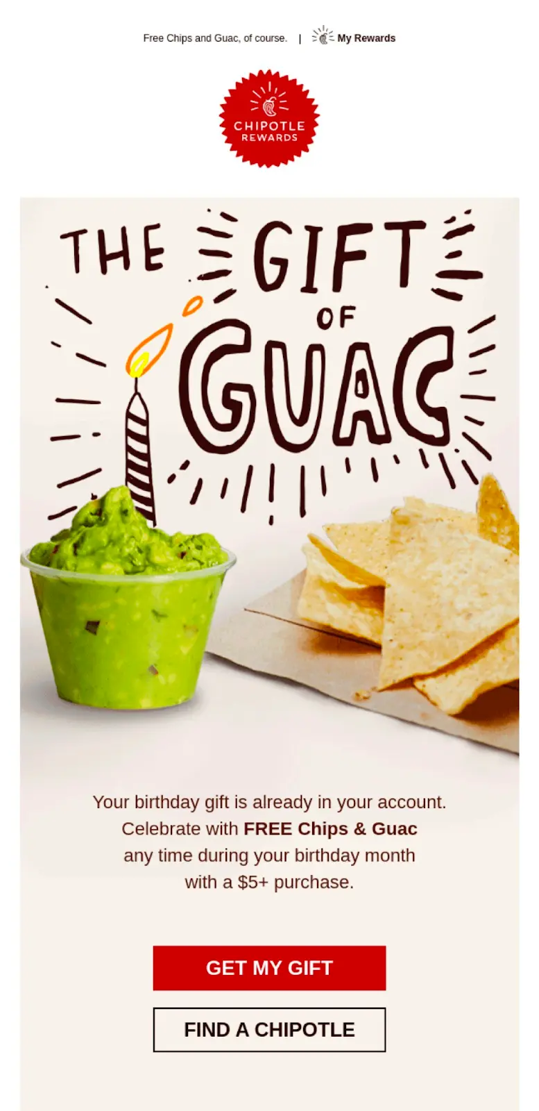
Make your offer stand out
This birthday email example from Chipotle showcases a brilliant marketing strategy. The "Gift of Guac" is not only quirky and engaging but also entices the receiver with a tempting offer on one of Chipotle's delicacies. Not only that, but the offer is applicable anytime during their birthday month, which promotes return visits.In addition, the call-to-action button attracts the reader's eye and offers clear instructions for the next steps.
Keep it Simple and Stay on Brand
When it comes to birthday emails, Outdoor Voices nails it by embracing the beauty of simplicity.A common mistake with birthday emails is that it is really easy to go overboard. Outdoor Voices does a great job of embracing the “less is more” approach to design and copywriting, which aligns with their overall brand identity.Another differentiating factor, when compared to Chipotle’s approach above, is that the offer is not the star of the email. Instead, the customer is. This strategy is great for strengthening connections with readers as they often feel less “sales-y. ”Regardless, they do a great job of ensuring the offer is still noticed by adding an on-brand CTA that stands out.

Nike's birthday email also beautifully embodies its athletic and dynamic brand essence. Featuring an athlete surrounded by playful hand-drawn elements, the email captures attention and reinforces Nike's iconic image. The straightforward offer of a 10% discount on a $100 purchase, combined with the exclusive feel of 'Member Access,' effectively incentivizes the recipient to shop.

Use a Humorous Approach
The following birthday email from Markiplier incorporates humor to create a memorable and light-hearted message. The message feels personable as it makes a joke about aging that a friend would make, yet emphasizes genuine appreciation.The offer for a discount on Markiplier store items adds an incentive to the comedic touch. If there's a lesson here, it's this: a good laugh can reel 'em in, but pairing it with a genuine offer? That's the cherry on top!

Exclusivity For The Win
If you're an avid Sephora shopper, you'll know their birthday mini sets are (unfortunately) not curated for the individual; however, this email makes you feel like it is.While using your reader's name is a great example of personalization, in this case, it isn't the star of the show.Sephora's unique layout, design, and use of high-quality images exude the feeling of "these were hand-picked just for you." The use of supersized imageslaid out was intentional to make these "minis" feel larger (and, in turn, more exclusive) than they are, which likely makes "Mary" feel special.They also subtly hint with a subtitle that "Mary" is receiving this exclusive offer because they are part of their "beauty insider" program, further promoting the feeling of exclusivity and encouraging customer loyalty.

Time Is Of The Essence? or Not?
The following two emails offer a different approach to birthday offer expiration dates.PixelBoosts offers a 30% discount to be redeemed within three days. Crafted for those looking to renew their subscriptions, this birthday email does a good job of blending the personal touch of a birthday email with a gentle nudge toward "stick around with us!"
On the other hand, the email below extends the festivities and gives the reader the entirety of their month to redeem their discount. The phrase "pick your own present" offers a sense of autonomy and personalization.

There are pros and cons for both strategies.While offering limited-time offers such as PixelBoost can be a great way to encourage urgency and conversion, finding the right time to send this email is important. According to Campaign Monitor, 55% of birthday emails are sent on the recipient's birth date. For limited offers such as 3 days, the challenge comes with not knowing whether the recipient will open the email in time as they might be taking some much-needed R&R.For birthday emails with a much longer deadline, while they offer recipients ample time to open and purchase, you risk them forgetting about your offer. In this case, reminder emails will be essential, turning birthday emails into birthday campaigns.As always, we recommend testing and monitoring what works best for you and your organization.
Personalized Product Recommendations
According to Epsilon, "80% of consumers say they're more willing to purchase when provided with a personalized experience." While, a birthday email alone is a strong example of this, Rachel Jackson's birthday email takes it one (or ten) steps further.
While we usually see product recommendations being personalized with the power of dynamic content and consumer behavior, Rachael Jackson takes a unique, maybe simpler, but still impactful approach using the recipient's birthstones.
The use of high-quality images and meaningful descriptions engages the recipient to learn more about their birthstone, which only further helps promote the feeling that "this was made for me."

Use Interactive Elements
When done right, videos, gifs, and polls are great ways to catch your readers' attention and guide them toward the desired action.While the email below is simple, the animated birthday cake and candle GIF catches the reader's eye and embodies the essence of celebration, warmth, and festivity. Again, while simple, the GIF enhancesthe user experience, making the offer more enticing and the email more interactive.

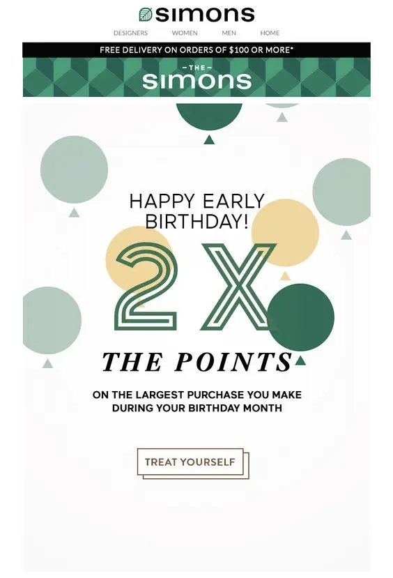
Loyalty Points Boost
Simons' birthday email effectively leverages a loyalty program by offering double points on the largest purchase made during the birthday month. The CTA "treat yourself" is strategically used to encourage a larger-than-usual purchase, possibly enticing the reader to buy something they might have been eyeing for a while. The double points incentivize the consumer as they are more willing to buy, knowing they will receive something in return.
Simon isn't just sending out birthday wishes but making it a win-win for everyone.
Best Practices for Engaging Birthday Email Campaigns
The best birthday emails are more than just a celebratory message; they're an opportunity to deepen your connection with your subscribers. To make sure that your birthday wishes stand out in a crowded inbox, it's important to follow some tried-and-true best practices.From creating an automatic birthday campaign to the art of the perfect call-to-action, here are our top secrets to crafting unforgettable birthday emails.
Automation is Your Birthday Campaign BFF
No one is to be left behind. Setting up an automated birthday campaign ensures subscribers feel acknowledged on their special day. It's not just about convenience; it's about consistency.Automation permits timely and personalized gestures that say, "We remember, and we care."
Send More Than One Birthday Email
One email is great, but why stop there? Celebrating a subscriber's birthday isn't just about the day itself; it's about the anticipation and the afterglow.Start with a warm pre-birthday greeting, followed by the main birthday wish, and perhaps a gentle reminder or a thank-you note a day or two later. It's a prolonged celebration that keeps the connection alive and makes your brand memorable.
Ensure a Smooth Redemption Process
If you're gifting your subscribers a birthday treat (and we highly recommend you do!), make the redemption process a breeze. The last thing you want is for them to jump through hoops on their special day. Whether it's a discount code, a freebie, or exclusive access, ensure they can claim it effortlessly.Part of this is ensuring a clear and compelling CTA. Whether you're nudging them to shop a birthday sale, read a special message, or claim a gift, your CTA should stand out.
Design Unforgettable Birthday Emails with Beefree
Whether it's a heartfelt message, a special discount, or an exclusive offer, it is proven that birthday emails strengthen brand-consumer relationships. And with only 31% of retail email marketers sending birthday greetings, there's a huge opportunity for you to stand out.As shown above, playing with color, layouts, images, and interactive elements is the name of the game. And while it might seem challenging and time-consuming at first, it doesn't have to be.With an intuitive drag-and-drop interface and a catalog of over 1,600 templates, Beefree makes designing birthday emails a piece of cake ;).Not sure where to start? Try this free birthday email template.

12 Exceptional Email Newsletters to Inspire You
Email newsletters stand as a beacon between your brand and your audience. In one cohesive and on-brand email, you can share everything from news to announcements to updates and inspire action, building stronger connections with your subscribers.The artistry behind crafting a newsletter that not only informs but captivates is a journey of balancing aesthetic appeal with potent content, ensuring each word and image is a step towards enriching subscriber engagement. As connoisseurs of well-crafted email newsletters, within the confines of this blog, we'll share 16 email newsletter examples, each uniquely highlighting the impact of successful communication in its own special way.
Behind the Best Email Newsletter Examples
Understanding the mechanics of email design means recognizing and appreciating the subtle nuances that elevate a newsletter from good to exceptional. Below, you'll find a collection of designs that brilliantly mix visuals and content, each one shining a light on the exciting opportunities that your own newsletters can explore.
E-Commerce Newsletter Examples
Serumize
The presented newsletter comes from "Serumize," a brand dedicated to skincare. This specific edition from their "Skintuation" blog emphasizes the importance of correct skin cleansing to achieve clear, healthy skin.

Stand-out elements:
- Engaging Content and Visuals:
- One of the standout features of this newsletter is its use of engaging content complemented by visually appealing imagery. The headline "Are You Cleansing Right?" is not only attention-grabbing but also prompts the reader to delve deeper into the content. When accompanied by high-quality images of the products and a model showcasing the cleansing process, it gives the viewer a comprehensive idea of what the brand offers.
- Clear Call to Action:
- The "LEARN MORE" button is prominently placed and effectively serves as a call to action. Its distinct color and positioning ensure it catches the reader's attention, leading them towards more detailed information or potentially to a purchase.
- Transparency and Trustworthiness:
- Serumize has incorporated icons at the bottom of the newsletter, highlighting the qualities of their products, such as "Cruelty-Free" and "Paraben Free." This not only informs the consumer about the product's attributes but also builds trust by showcasing their dedication to safe and ethical formulations. Additionally, the personal touch in their thank you note at the end adds a feeling of community and appreciation, making the reader feel valued and connected to the brand.
Business Newsletter Examples
Moz
This newsletter is from Moz, a reputable name in the domain of search engine optimization (SEO) and digital marketing. Through its "Moz Top 10," the brand aims to provide its subscribers with valuable insights, updates, and resources in the ever-evolving realm of SEO and online marketing.

Stand-out elements:
- Curated Quality Content:
- Moz's strategy of listing the top 10 articles or resources is an excellent way to keep readers informed about the latest and most pertinent topics in the industry. Each entry is concise yet descriptive, allowing subscribers to gauge the relevance and importance of the content quickly. This curation reflects Moz's expertise, providing readers with confidence that they're getting a distilled version of the most significant industry happenings.
- Variety and Interactivity:
- Including diverse resources, from video sessions like "TechSEO Boost 2019" to interactive games like "The Search," showcases Moz's commitment to catering to various learning styles and preferences. By mixing traditional resources with more engaging, interactive content, they ensure that readers remain engaged and are more likely to explore the provided content further.
- Clear Value Proposition and Incentives:
- The newsletter not only updates readers but also offers tools and resources that can be directly implemented, like the "Google Search Console – Quick Insights (Google Sheet)." Additionally, the promotional segment at the bottom about an "Early Bird" discount serves as an incentive for readers to act and get involved with Moz's offerings, effectively driving potential conversions
The Hustle
The newsletter presented is from "The Hustle," a daily business and technology news platform that condenses vital information into bite-sized, digestible pieces. This edition, dated May 7, 2021, delves into the intricacies and value proposition of airline loyalty programs while also offering readers a mix of interesting tidbits and thought-provoking snippets.

Stand-out elements:
- Engaging Big Idea Segment:
- The newsletter opens with a "Big Idea" section, focusing on airline loyalty programs. By leading with a captivating visual and a headline that poses a question, the Hustle immediately piques the reader's curiosity. The section provides key insights, like the surprising financial value of loyalty programs compared to actual airline operations. Such an approach not only educates but also offers a fresh perspective on a topic many might assume they're familiar with.
- Diverse Range of Content:
- One of the strengths of this newsletter is the diversity in content. Beyond the main story, there are "Snippets," which cover various topics from finance to sports and media, catering to a broad audience spectrum. This strategy ensures that even if a reader isn't particularly interested in the main topic, other sections might catch their attention, increasing overall engagement.
- Shower Thoughts for Engagement:
- Adding a touch of whimsy, the "Shower Thoughts" section offers quirky and contemplative statements likely to resonate with many readers, potentially becoming a talking point or even being shared on social platforms. This inclusion, while seemingly light-hearted, enhances user engagement and offers a delightful conclusion to the reading experience.
Product Newsletter Examples
Fridababy
The showcased newsletter is from "Fridababy," a company specializing in innovative baby and toddler products designed to simplify parental challenges. This edition is dedicated to introducing their new product, the "DermFrida Bath Mitt," aiming to transform bath times into a fuss-free experience for parents and their little ones.

Stand-out Elements:
- Eye-Catching Visuals and Cohesive Design:
- Fridababy has effectively used vibrant, playful visuals that immediately draw attention to the new product. Using a child's illustrated hand juxtaposed with the actual product not only adds a fun element but also emphasizes the product's utility. The cohesive color palette, centered around the product's color, further accentuates the product and creates a visually appealing design that's consistent throughout.
- Clear Information and Benefits:
- The newsletter does a commendable job of highlighting the product's features, from being a "quick-dry" mitt to its "bacteria-resistant" nature. The segment "A Tub Without Tantrums" cleverly emphasizes the primary benefit for parents—making bath time a breeze. The succinct points give a quick overview, allowing potential customers to grasp the product's advantages at a glance.
- Comprehensive Product Range Showcase:
- Towards the end, the newsletter smartly showcases a range of their other products, reminding subscribers of their holistic approach to baby care. This not only reinforces brand recall but also encourages cross-selling. The invitation to "Join the Fridababy Babble" further promotes community engagement and brand loyalty.
The Body Shop
The featured newsletter comes from "The Body Shop," a globally recognized brand known for its ethically produced beauty and skincare products. This edition emphasizes their new avocado-themed body care range, showcasing the benefits of this natural ingredient while highlighting promotions and the essence of the brand's ethos.

Stand-out Elements:
- Cohesive Thematic Presentation:
- "The Body Shop" has brilliantly leaned into the avocado theme, creating a visual treat for the eyes. From the prominent avocados to the green-hued product packaging, everything in the newsletter ties together seamlessly. This cohesive presentation not only emphasizes the natural ingredients of their products but also creates a memorable and distinct visual identity for this specific range.
- Clear Call-to-Action and Offers:
- Throughout the newsletter, there are clear and enticing CTAs. Whether it's the playful "Smash that buy button" for the avocado range or the "Buy now" for the 20% off promotion, each segment clearly guides the reader on what to do next. Coupled with attractive offers and promotions, it nudges potential customers towards purchasing.
- Emphasis on Brand Values:
- The "Spread Love" section at the bottom, featuring diverse models, is a subtle yet powerful nod to the brand's commitment to inclusivity and positive body image. By incorporating this imagery and message, "The Body Shop" reinforces its brand values, creating a deeper connection with its audience beyond just the products it sells.
Professional Newsletter Examples
Your City
From interactive scavenger hunts to melodious live music sessions and delightful tasting events, the city is bustling with activities for locals and tourists to indulge in and enjoy.

Stand-out Elements:
- Clear Visual Cues and Structured Layout:
- The newsletter employs a clear and straightforward layout, a boon for easy readability. The dominant imagery of the city's iconic building sets the geographical context instantly. Dates are boldly highlighted, ensuring readers can swiftly pick out the timings for each event. The accompanying images for each event serve as visual cues, giving readers an instant feel of what to expect.
- Concise and Informative Descriptions:
- Each event's description is concise yet comprehensive enough to give readers a clear idea of the activity. The "Let's Roam Scavenger Hunt," for example, is not just presented as a fun outdoor activity but is specifically pitched towards tourists, locals, and newcomers alike, broadening its appeal. The "Velour Live Music" description mentions the owner's name and the venue's unique selling points, such as a smoke and alcohol-free environment.
- Call to Action and Accessibility:
- Strategically placed at the bottom, the contact information ensures that interested parties have a direct line to the organizers. An email address allows for easy communication, while the placeholders for address and phone number suggest that the newsletter would provide multiple ways for readers to reach out, enhancing user accessibility and interaction.
Webinar Newsletter Examples
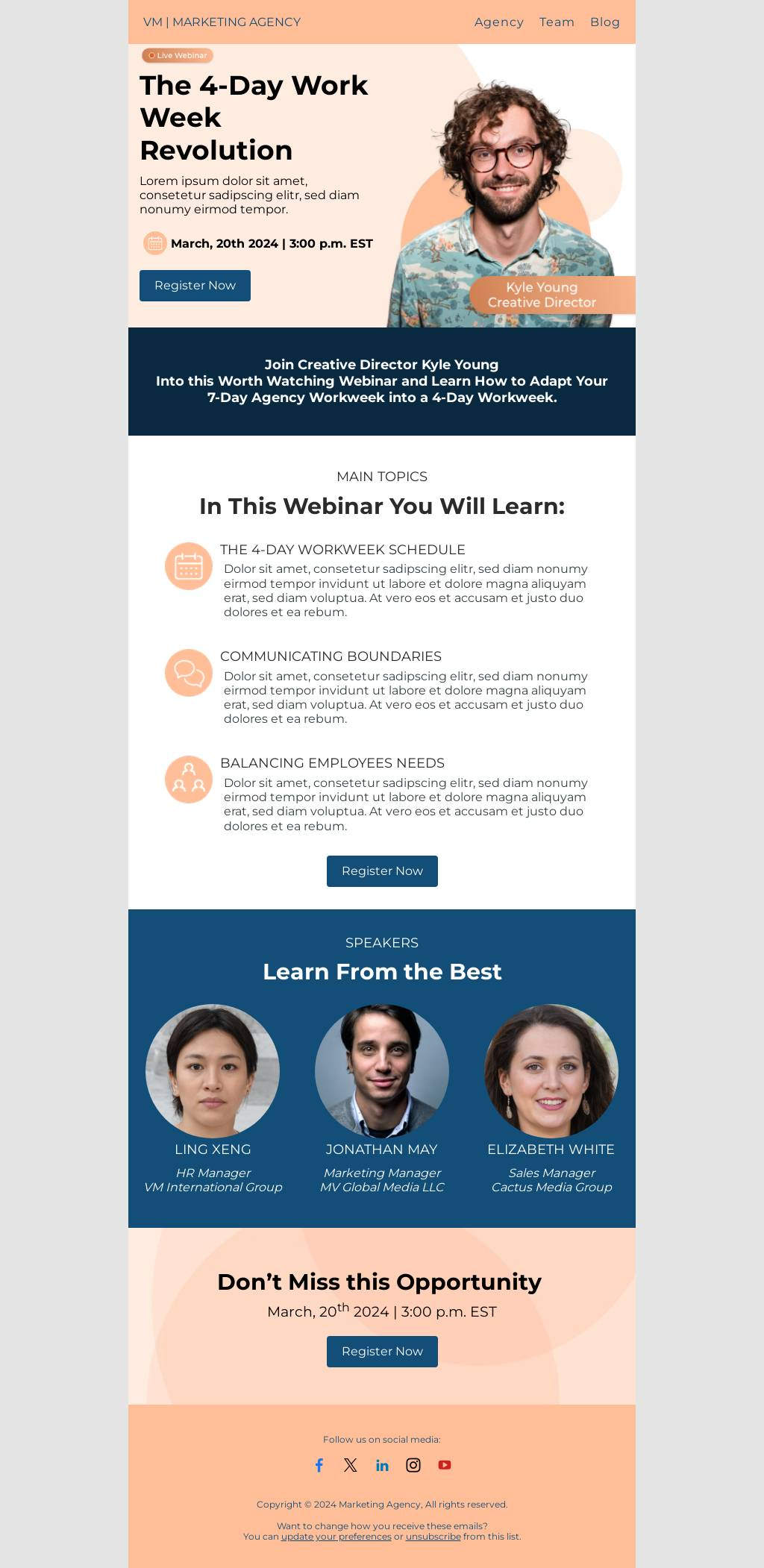
Fluent
This newsletter is from Fluent, a marketing company, announcing a collaborative webinar with ActiveProspect. This webinar aims to provide insights and strategies for building a superior call marketing plan for 2022, appealing to businesses and marketers looking to enhance their communication strategies for the upcoming year.

Stand-out Elements:
- Visual Clarity and Conciseness:
- One of the standout features of this newsletter is its clear, concise, and visually appealing design. The bold, catchy header "How to Build a Better Call Strategy for 2022" immediately captures the reader's attention. Including headshots of the speakers adds a personal touch, giving a face to the experts who will be presenting. The highlighted date and time ensure readers can quickly jot down the event in their calendars.
- Detailed Content with a Direct CTA:
- The newsletter does an exceptional job of detailing the webinar's objectives in a bullet-point format, which allows potential attendees to gauge the content at a glance. By touching on crucial points like transparency, consumer journeys, and compliance best practices, Fluent emphasizes the comprehensive nature of the webinar. The clear "Register" button is a straightforward call-to-action (CTA), prompting immediate registration. Additionally, the assurance that a recording link will be sent even if someone cannot attend the live session helps capture a broader audience.
- Transparent Communication:
- The footer section, which includes Fluent's address and an unsubscribe option, ensures transparency and adheres to best email marketing practices. It establishes trust with the recipients, showing that Fluent respects their privacy and their right to opt out of such communications.
2C2P
By providing solutions that facilitate payments across diverse markets, 2C2P positions itself as a critical bridge in the digital payments ecosystem. This specific newsletter emphasizes their upcoming participation in the IDC DX Summit and a webinar centered around the buying and payment trends in Southeast Asia.

Stand-out Elements:
- Clarity and Segmentation:
- One of the standout aspects of this newsletter is the clarity it offers. Each section is distinctly separated, allowing for easy navigation. Whether it's the invitation to the IDC DX Summit or the details about the webinar, readers can quickly glean the primary focus points, enhancing user experience.
- Engaging Content and Value Proposition:
- The description of the digital economy's growth and the potential it holds for businesses is compelling. By highlighting numbers like the "US$280 billion mark by 2025," the newsletter taps into a sense of urgency and opportunity. Moreover, by showcasing their CEO, Aung Kyaw Moe, as the speaker for the webinar, 2C2P is subtly underscoring their expertise in the domain. The emphasis on the complexities of the payments ecosystem in Southeast Asia positions the webinar as a must-attend for businesses keen on tapping into the region's potential.
- Direct Calls to Action (CTA) and Accessibility:
- The newsletter doesn't merely provide information; it guides the reader towards specific actions. The "Register for our webinar here," "Sign up for the FREE webinar!" and "Get in touch" buttons are direct CTAs that foster engagement. Additionally, providing a direct link to download the complete agenda for the IDC DX Summit ensures readers have immediate access to detailed information.
Blog Newsletter Examples
Julie Blanner
The newsletter in focus is from Julie Blanner, a lifestyle influencer known for her approach to easy recipes, effortless entertaining, and minimalist style. Through this newsletter, she introduces her readers to her favorite coffee table books and extends an invitation to her free masterclass on starting and growing a blog.

Stand-out Elements:
- Personal Touch and Relevance:
- One of the standout elements of this newsletter is its personal touch. Addressing the recipient by name ("Hi Marilia") creates an instant connection, making the reader feel individually acknowledged. Furthermore, by offering content on coffee table books, Julie provides value that aligns with her brand's aesthetic and resonates with her target audience's interests. This tailored content is crucial in capturing and maintaining the reader's attention.
- Visual Consistency and CTA:
- Julie's newsletter excels in visual consistency. The soft, muted color palette and the curated images reflect her brand's essence and the promise of "minimalist style." The images not only provide visual appeal but also offer a sneak peek into what readers can expect by clicking on the "Read More" or "Learn More" CTAs. Clear and concise CTAs encourage user interaction and lead the reader down a predetermined path, increasing the chances of conversion.
- Offering Value and Engagement:
- Julie's invitation to her free masterclass on blogging is a strategic move to engage with her readership further. By offering something of value, like a masterclass, she not only establishes her expertise but also fosters a deeper relationship with her community. Additionally, including her profile at the bottom, complete with social media links, ensures that readers have multiple avenues to connect with her and explore her content further.
Restaurant Newsletter Examples
Allset
This newsletter is from "Allset," a platform facilitating a seamless dining experience by allowing users to order meals ahead for dine-in or pickup. This particular communication promotes their "Takeout August" campaign, aiming to incentivize users with a daily $2 off on their pickups.

Stand-out Elements:
- Eye-catching Design and Clear Messaging:
- One of the primary strengths of this newsletter lies in its visually appealing design. The bright red background immediately captures attention, and the contrasting yellow emphasizes the promotional offer. The headline "Takeout August" followed by "extra $2 off" succinctly conveys the essence of the promotion. Furthermore, the image of a delicious meal not only tantalizes the taste buds but also gives a visual cue about the brand's service – offering delightful meals at a discount.
- Direct Call to Action and User Convenience:
- The newsletter uses multiple "Order now" buttons, strategically placed after introducing the offer and towards the end. This ensures that at any point if the user is convinced, they have an immediate way to act. Additionally, the mention of "No-Contact Pickup" and "Curbside Pickup" addresses current health and safety concerns, showcasing the brand's commitment to user safety. Such features can significantly enhance user trust and increase the likelihood of conversions.
- Integration of Mobile and Encouragement for Recurring Use:
- By displaying App Store and Google Play buttons, the newsletter encourages users to download the allset app, pushing for a more extended engagement. Coupled with the statement, "Not sure what to get? We’ve got plenty of options that can easily become your everyday fix," the brand subtly promotes recurring use, aiming to make their service a part of the user's daily routine.
Sweetgreen
The displayed newsletter is from "Sweetgreen," a brand known for its dedication to fresh, wholesome food offerings. Catering to the health-conscious and those who appreciate vibrant flavors, this particular communication emphasizes their summer-themed salads, reminding customers that summer is far from over.

Stand-out Elements:
- Vibrant Visuals and Seasonal Relevance:
- The use of fresh, bright imagery in this newsletter not only emphasizes the freshness of the ingredients but also evokes a sense of the summer season. By stating, "Summer is going strong," Sweetgreen captures what many love about the season – the warmth, vibrancy, and extended daylight. This strategic play on the sentiment resonates with the audience, making them more inclined to indulge in the salads and extend their summer feelings.
- Detailed Descriptions and CTA:
- Each salad is accompanied by a brief, flavorful description that tantalizes the reader's palate. Phrases like "watermelon + spicy cashew" or "peach + goat cheese" are not just ingredients; they narrate a flavor story, hinting at the delightful contrasts one can expect. The repeated call to action – "Taste the summer" – is a compelling nudge, inviting readers to experience these flavor combinations for themselves.
- Brand Mission and Accessibility:
- Closing off with "connecting people to real food" not only reinforces Sweetgreen's brand mission but also subtly communicates their dedication to quality and authenticity. The inclusion of social media icons and their physical address enhances accessibility, giving readers multiple avenues to engage with the brand, whether it's for feedback, queries, or simply to follow their journey.
Company Newsletter Examples
Star Capital Bank
A renowned financial institution, Star Capital Bank, seems to be expanding its portfolio with a product that aims to benefit the globetrotters by offering them rewards, discounts, and perks for their travels.

Stand-out Elements:
- Clear Highlight of the New Product:
- At the outset, the newsletter grabs attention with a vibrant visual of the travel credit card. Accompanied by the phrase "Introducing our new travel credit card," the positioning makes it instantly clear what the main focus of the communication is. This direct approach ensures that readers immediately understand the core message without distractions.
- Emphasis on Benefits:
- Rather than just listing features, the newsletter smartly emphasizes the benefits of using the travel credit card. The section "Make Every Dollar Count" details the rewards and perks cardholders can avail of, like 3x points on various categories and significant discounts. By outlining these tangible benefits, the bank effectively communicates the card's value proposition, making it more enticing for potential customers.
- Personal Stories and Destination Highlight:
- The spotlight sections, featuring Lucia's story and highlighting Brazil as a top destination, add a personal touch to the newsletter. Lucia's story offers a testimonial of sorts, detailing how the card benefited a real customer, which can resonate with readers and build trust. The Brazil feature, conversely, not only taps into wanderlust but also showcases how the card can be used for diverse travel experiences.
Create Email Newsletters That Stand Out With Beefree
In today's digital age, capturing your audience's attention is more challenging than ever. It is paramount to craft email newsletters that truly resonate and stand apart from the myriad of messages flooding inboxes daily. It is just as important to have the right tool to create email designs effortlessly.
That's where Beefree comes in.
Beefree offers 1,500+ customizable newsletter templates to fit your individual company needs. Our drag-and-drop editor makes it easy for anyone on your team to simply swap out content, add your branding, and export using your favorite sending platform. The best part? It's free. Happy designing!

9 Engaging Email Newsletter Design Tips and Ideas
When it comes to digital marketing, the tried-and-true email newsletter has proven to be a reliable communications tool for businesses of all sizes. Today, 41.5% of companies use email as a critical component within their marketing plans, and 81% of B2B marketers send email newsletters as part of their content strategy. Email is a proven marketing standard, and a newsletter is an easy way to communicate with customers, prospects, partners, or subscribers.
Despite the growing preference among consumers for receiving information via SMS and social media, email still reigns supreme, with 55% of consumers choosing to stay up-to-date with their favorite businesses via this channel. Email newsletters are one way to deliver engaging content through attractive designs while sharing valuable information with customers.
In this guide to engaging email newsletter design, we offer ten expert tips for designing engaging, creative, and thoughtful email newsletters to optimize engagement and elevate your brand.
How to Craft an Engaging Email Newsletter Design
Constructing an engaging email newsletter design requires a thoughtful blend of creativity, strategic know-how, and a basic understanding of best practices. Let's explore the world of email newsletter design and the elements that can make your campaigns stand out in a crowded inbox.
1. Newsletter layout and format: The Foundation
An email newsletter's layout and format serve as the foundational elements of your digital design. A clutter-free, well-structured format for newsletters helps improve readability and engagement with the content. The most crucial information in the newsletter should be at the top, with the lower body text neatly divided into sections using bullet points, headers, and sub-headers. We recommend a good amount of whitespace to improve readability and lend your newsletter a modern, minimalist feel.
The template newsletter uses a structured, clean format to highlight its content effectively, while eye-catching headings, colorful buttons, and well-spaced sections ensure a seamless reader experience.
2. Go Mobile or Go Home
Smartphones are everywhere and almost certainly in the hands of your email subscribers. Nearly half of all emails are opened each day on a mobile device, so ensuring compatibility is a must. Be sure your email newsletter is optimized for mobile with designed content, fonts, and CTA buttons that work effectively on a smaller screen for the best user experience.
To improve the reading experience on a mobile device, consider these design tips:
- Use a single-column layout to avoid the awkward side-scroll
- Keep the copy simple because no one likes to read a book on their tiny mobile screen
- Use standard fonts that are easily read on a hand-held device
- Keep colors limited and on-brand to avoid unnecessary eye strain
3. Typography Appeals to Readers
Fonts are essential in enhancing your email newsletter's visual appeal and readability. It’s best to stick to two or three fonts maximum – one for headlines, one for subheadings, and another for the body text. This approach ensures legibility and creates a sense of visual harmony.
When choosing fonts that readers will view online, experts recommend using a sans serif font like Arial, Helvetica, or Verdana. These fonts are the easiest to read and are most compatible with digital programs.
When designing an email newsletter for a desktop, it’s best to keep header text in the 22-24pt range and body copy between 14-16pt. Design your email using a responsive program, so the font size will adjust for a comfortable reading experience on mobile as well. We’d also recommend limiting the amount of text in your newsletter as much as possible so as not to overwhelm the reader. When you have a longer article to share, consider linking a teaser on your newsletter to the full article on your website.
Read more: How to Choose the Best Font for Email
4. What Your Colors Convey
Color psychology is a unique way to understand how colors can impact how someone feels. Did you know that your brand colors may have a certain emotional appeal to people? For example, research shows that black symbolizes power and status, green conveys wealth and relaxation, and yellow can make you feel optimistic or youthful.
It's essential to choose a color scheme for your email newsletter that resonates with your target audience psychologically. It’s also important to understand how your color choices could impact accessibility for those with vision impairments. However, you want the color scheme you choose for your emails to be consistent with your brand identity. This is important to ensure brand recognition and consistency.
The email template above is for a gaming audience. Notice how the use of color evokes a playful feeling and, alongside the layout, helps guide and engage the reader throughout. You can also see how the use of typography catches the reader’s interest.
Read more: 10 Creative Ways to Use Color in Email
5. Visual Perception is Everything
"A picture is worth a thousand words," even in email newsletters. Including relevant, high-quality images can enhance engagement levels and draw readers in. Make sure the images you choose thoughtfully reflect your brand identity and the message you are sharing. It’s also important that your email design is accessible and inclusive, staying consistent with your branding and themes. For example, the higher education template below uses images and icons to provide further context for the message and provides useful information about what the email is about with just a glance.
6. Capture Your Brand Through Tone and Copy
Beyond the look and feel of your newsletter, engaging copywriting is at the heart of your newsletter. Marketers should always strive for content that is not only valuable to the reader but interesting and personable. Use a tone that echoes your brand’s personality and write as though you’re speaking directly to the reader, making your content more relatable and human.
Read more: The Non-Marketer’s Guide to Writing Emails Like a Copywriter
7. Call Readers to Action
Well-crafted call-to-action (CTA) buttons guide your readers toward taking a specific action and engaging them deeper. Be sure your CTAs stand out, are compelling, straightforward, and meet accessibility standards. This includes making clickable areas large enough to be easily tapped and providing labels for links that screen readers can read. The email template below is an excellent example of how a prominent, clear CTA button can capture attention and invite action.

8. Consistency is Key
Consistency is the key to growing ongoing readership, from colors and fonts to imagery and sending schedules. The best times and days of the week to send your email are determined by when your audience is most active. Try testing a variety of times and days to see if one is better than another. Being consistent helps your readers to recognize your newsletters, fostering trust and brand loyalty.
9. A Newsletter Can Be Personal
It might surprise you that we suggest personalizing email newsletters, but the results speak volumes about why. Personalization can substantially improve engagement rates, with open rates improved by as much as 50%. Leverage your subscriber data to tailor content, subject lines, or images to individual readers, making your newsletters more relevant and engaging.
BONUS: Use Email Newsletter Design Templates to Get Started
If you're overwhelmed by the idea of starting an email design from scratch, Beefree's email newsletter design templates are a quick and efficient solution. These templates provide a great starting point for designing engaging newsletters with proven structures and designs you can customize to suit your brand, or they can be used for newsletter design inspiration or newsletter format ideas.
An engaging email newsletter design blends style, content, and user experience. With Beefree, you can customize email newsletter designs to your heart's content, mixing your creativity with the best practices discussed in this article.
Why wait? Start designing today with Beefree, and let your newsletters do the talking.
Creating An Effective Email Sign-up Form: 6 Expert Design Tips
In the dynamic landscape of digital marketing, an email sign-up form serves as an instrumental tool in fostering connections between businesses and audiences.
As a precursor to long-term customer relationships, an email sign-up form fuels lead generation and enables businesses to personalize communication based on user preferences.
Here we'll explore the essential elements of an effective sign-up form, from design to copy to layout, supported by real-life examples and industry best practices. As well as discuss strategies to engage subscribers post-sign-up.
How to create a high-converting email sign-up form: The key elements
Crafting an email sign-up form that guarantees conversions hinges on assimilating key elements into your design. Here are six essential elements supported by industry statistics. Note that these aren't exhaustive but are a great foundation to begin with!
Simplicity
Simplicity is the cornerstone of any high-performing email sign-up design. Fewer fields translate into less work for a user, leading to higher sign-up rates. In fact, statistics reveal that reducing form fields from four to three can boost conversion rates by up to 50%.
It's important not to confuse simplicity with a lack of detail and clarity. For example, we don't want to keep the customer from important information (such as privacy details) for the sake of simplicity. Still, we don't need to include the entire Terms & Conditions on the sign-up page (this can be appropriately linked).
CTA Button
The Call-To-Action (CTA) button is another common element of a sign-up form. Making the CTA button stand out using a contrasting color can enhance conversion rates by 14.5%.
Read: What's the best CTA button color for emails?
Privacy Statement
Users are growing increasingly conscious of data privacy. A privacy statement offering assurance of data safety can increase form fill-outs by 19%.
For extra security, you can also include a double opt-in email. This email is sent automatically to your new subscribers with a link to confirm the email address. By doing this, you can highlight your commitment to subscriber consent and ensure email addresses have been entered correctly!
Incentives
Giving incentives act as persuasive agents for users to sign up for your emails. This could be in the form of a freebie, discount code, or free trial. But really, any content that is not accessible to those who have not signed up.
Google found that 90% of customers will share their email for an incentive, so it's highly likely to reap more rewards than any incentive will cost.
Design and Placement
The visual appeal of a sign-up form and its strategic placement on your website can significantly influence user interaction.
For example, forms placed above the fold tend to capture significantly more leads than those placed below, as customers generally lose interest fast.
You can also create a pop-up form that appears after a certain period or when you visit a certain number of pages on the site. Just ensure these don't "pop up" too quickly, or it can put potential subscribers off!
Testing and Monitoring
A/B testing and performance tracking of your forms can reveal critical insights. Businesses with a clear testing and monitoring strategy can generate up to 45% more leads.
Design Elements in Practice: Email Sign-up Form Examples
Now, let's explore some noteworthy examples of the best sign-up form practices.
These email sign-up forms have been chosen to highlight specific design, copy, and placement strategies for you to utilize, but of course, they are not exhaustive! We recommend researching your competitors and favorite brands and using this list as a guide for what to look for when aiming for a lead into a newsletter subscription email.
Using Minimalistic Design: Highway Robery
Highway Robery showcases how minimalism can lead to a compelling sign-up form. Their approach of "less is more" results in a design that's straightforward and free of clutter, allowing the user to focus on the sign-up process without unnecessary distractions.
They also use the contrast of black on the peach to make the CTA stand out, effectively guiding users to complete the sign-up.
It's got an engaging text that includes a brand-related pun and one input field, and the form contains no images, so the engaging copy is the main attention-grabber here.
The Power of Visuals: Primal Pet Foods
This sign-up form exhibits the power of engaging visuals. By pairing creative imagery with a simple form layout, they create a connection between their brand and the user's emotions.
This emotional engagement can boost conversions significantly. In fact, compelling visuals have been shown to increase user engagement by up to 94%.
Also, note the volume of information this sign-up form example requests. Alongside the email, they ask the subscribers for their name, zip code, and pet-related info. While this may seem long, they have cleverly utilized the UI and made two-question check circles much easier and quicker than writing and more likely to get responses!
This allows them to collect valuable customer information and tailor further communications effectively.

Providing Value Upfront: Sherwood Media Snacks
This sign-up form cleverly highlights the value proposition by promising a "3-minute newsletter with fresh takes on the financial news you need to start your day". They clarify what subscribers will gain from signing up, providing an immediate incentive.
Using Social Proof: LKR Social Media
LKR Social Media includes a quoted testimonial on their sign-up form, leveraging the power of social proof.
This establishes credibility and enhances trust, which can significantly increase sign-ups. 92% of consumers trust user-generated content more than traditional advertising.
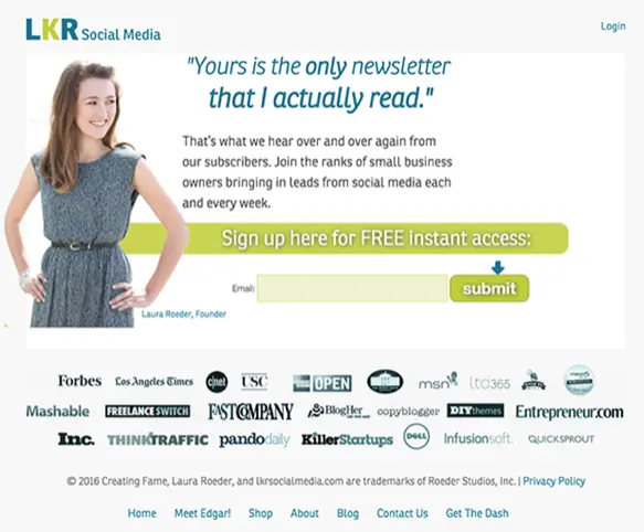
Integrating an email sign-up form: SUMO
SUMO integrates its sign-up form into its homepage layout and utilizes the above-the-fold method mentioned earlier. This seamless design can increase sign-ups as it does not disrupt the user experience and feels like a natural part of navigation.

Engaging Your audience beyond the email sign-up form
An effective email sign-up form is a fusion of design aesthetics, user psychology, and strategic thinking. And if you've made it this far, you're one step closer to transforming your sign-up form into a powerful lead-generating and customer-engaging tool.
The next step is to maintain their interest and engagement. An excellent way to initiate this engagement is by sending a welcome email. Welcome emailshelp generate 320% more revenue per email than other promotional emails.If you're ready to get started, explore our catalog of thousands of templates to help you attract, maintain, and nurture your audience. Happy designing!

Design A Student Onboarding Email From Start to Finish Using Beefree
There are various ways that your university can leave a lasting first impression on incoming students. A great example is orientation day/week. This event typically starts a few weeks before the academic year begins. It is an effective way to get students to meet their classmates and teachers, tour the campus, and experience a small glimpse of the next four years. Undoubtedly, this is an important step in getting students excited and engaged. But what if there was a way to emulate this excitement far before orientation?
The onboarding process for a student is crucial in how they will feel coming into your university. How you handle the onboarding process determines how safe and secure a student feels about their decision and their willingness to engage in university activities such as clubs, volunteering, and even their classes.
Most universities miss that student onboarding begins the moment they decide to attend their institution. So, how can you create a student onboarding experience that gets them excited from Decision Day and beyond?
Student Onboarding Emails
An affordable and effective way to create an impactful student onboarding experience is through emails.
An impactful onboarding email is a great way to welcome students to college and communicate important information that prepares them for success and excites them about the journey ahead. Frequent and resourceful communication allows students to feel sure about their decision, which supports student retention and engagement rates.
Beefree makes creating on-brand email sequences easier for higher education marketers by providing optimized and mobile-friendly email templates.
But, before digging into your email’s design, let’s discuss the best way to get started with a student onboarding college newsletter.
Before designing, establish your goal.
The first step to creating email communication is to identify who the audience is and what information they need. Next, consider your goals for communication in the example of a college student onboarding email. When thinking about goals, also think about the types of content that would help you achieve them.
- Student Orientation - provide helpful campus information like facility hours, building policies, and available student resources.
- Engagement - build community by sharing information about upcoming activities or social events.
- Retention - ensure students have a great start to the year by sharing tips for success in the classroom and how to make new connections.
What goals does your email marketing team have? Strategizing them and listing them out can keep everyone on track for building a successful student onboarding college newsletter.
Let’s get to design.
Start from scratch or use an email template.
Beefree makes email communications a breeze for higher education email marketers.
Choose an existing template or create a new one from scratch. There are pros to both!
Beefree templates are professionally designed with your audience in mind and optimized for conversion. By starting with an existing template, you don’t have to worry about identifying which sections your audience needs, which layout, or where to add images and personalization. Simply drag and drop your unique content into the template and change style guidelines to ensure you stay cohesive with your university’s brand identity.
If you’re going the template route, start here: Higher Education Template Collection.
By “starting from scratch,” the possibilities are endless. Beefree gives you the unlimited design freedom to create fully customized email experiences by adding brand images, campaign videos, gifs, and more.
Email Design Best Practices for Using Beefree
Beefree allows anyone to design emails with ease, regardless of experience. Our intuitive builder is easy-to-use and requires minimal time to get the hang of it. Here are a few features that will allow you to get the most out of Beefree.
- Style settings - Whether you’re starting from scratch or using a template, start by setting your style guidelines into Beefree. Add your universities color palette, font systems, buttons, icons, and even select your desired width for emails and pages to get an easy start to design.
- Image library: Upload and keep your universities campus, faculty, and event images in one place so that everyone can access them easily when creating future emails or landing pages.
- Saved rows: Once you’ve built your repetitive content blocks, such as footers and headers, save them and reuse them for next time!
- Synced rows: Great for saved rows that need to be regularly updated, such as menu bars, social links, and terms and conditions. All changes made to a “synced row” will auto-populate in all other templates where that row lives, saving you time and minimizing errors.
Double Check Everything on Mobile Design Mode
Okay! So you’ve customized your email or template to your liking and saved your rows for next time. Now it’s time to test it on mobile.
85% of people open emails using their smartphones; therefore, it’s crucial that all emails are built with mobile in mind.
Beefree offers Mobile Design Mode to help you visualize exactly how your content will be shown on mobile.
A PRO tip is to toggle between desktop and mobile while designing to save time and make changes as you go
With Beefree, any changes to the below elements will only be applied to mobile mode for an optimized mobile experience:
- Alignments
- Button widths
- Paddings
- Spacer heights
- Text sizes
- Reconfiguring of elements
- Hiding elements
The best part about using Beefree for designing mobile-friendly emails is that there is absolutely no coding required.
Read: Email Design for Mobile: Best Practices to Take Your Email Marketing Up a Level
Collaborate with your team.
You’ve completed your email. Now it’s time to get feedback from your team. Simply begin the review process using our “Request for Approval” feature. The flow will then guide you and your team toward a fully on-brand and approved student onboarding newsletter.
This feature is available for Enterprise customers only, but Free and Team plans can still enjoy seamless collaboration by:
- Using “Send Test” to send your email designs to team members and request feedback.
- Provide comments within the email builder.
- Customize user and permission settings to let team members edit content (or not).
Engaging your whole marketing team to create a memorable student onboarding experience has never been easier.
From an Email to a Landing Page, Easy.
Once you have your email designs done and approved, it’s time to create additional assets that allow you to create a cohesive onboarding experience. Landing pages are a great way to expand the information included in your emails and further create an impactful onboarding experience for incoming students.
With Beefree, you can convert any email into a one-page landing page with just one click. From there, you can easily adjust the layout, content, and CTAs.
Start Designing Your Student Onboarding Emails With Beefree
The best part? It's free to get started.Create student onboarding email sequences, orientation day invitations, course reminders, and so much more. Sign up now!

5 Email Design Tips for Alumni Engagement to Increase University Fundraising
In 2021, U.S. colleges and universities raised an impressive $52.9 billion toward their fundraising goals. Alumni donations accounted for 23% of that total, showing just how important strong alumni engagement is for a university's success.So, how do universities use the money donated by alumni?
- Maintain operations
- Offer scholarships
- Improve/update technology
- Support specialty programs, such as study abroad and athletics
- Revitalize campus facilities
- Fund research programs
Higher education institutions rely on donations to support their everyday operations and to be able to give back to the students through events, tools, resources, and courses. Coupled with the changes in the workforce and mostly digital society, funds acquired help universities provide students the latest software and technology, setting them up for success.
5 Tips to Increase Alumni Engagement Using Email
Statista projects businesses will send more than 375 billion emails daily by 2025. This means that any email communication you send to alumni must command (and keep) their attention.
We Know You Hear This A Lot, But Write Compelling Subject Lines!
The subject line is truly the most important line of copy in an email. Why? Because it helps alumni decide whether they want to open the email or not.A great subject line evokes an emotion, elicits curiosity, and at times, makes them laugh. But most importantly, emails for alumni serve as reminders of why they love their Alma Mater.Here are some tips for writing an attention-grabbing subject line.
- Keep it short: you should grab their attention with as little as 40-50 characters.
- Don’t sound spammy: even though you may want to give away a free item in exchange for a donation, don’t use “free” in the subject line, or your message could go to spam.
- Ask a question: use a question to remind them of a college memory, like cramming for a test in the library.
- Create a sense of urgency: remind them students need their support now for the upcoming year
Besides keeping it short and clear, here are some additional elements (with examples you can steal) to create a subject line that gets alumni to open:
- Draw curiosity: – trust us, you don’t want to miss out on this
- Urgency: One day left to make a difference!
- Belonging: We couldn’t have done it without you
- Personalized: , your help is needed
Use Personalization to Connect with Alumni
As we mentioned before, email inboxes are busy places. Personalization is an excellent way to get alumni to engage. When scrolling through the list of unread emails, readers are more likely to click on an email that calls them out personally.In fact, research shows personalized content engages readers. It improves open rates by 11% and clicks by 27%.When using personalization, consider what you know about your audience to generate successful email campaigns. Some personalized fields include:
- Name
- Last gift amount
- Donation history
- Graduation class
- College field of study
Use this information to interest readers beyond a simple “Hello, John.” We recommend weaving personalized details throughout the message to strengthen the idea you’re trying to communicate.Here are some ways to integrate personalization into a fundraising message:
- Thank you for your gift of [$10,000] last year.
- We appreciate the generous donations coming from the .
- Your support is helping to keep the department thriving.
Web is Dead: Optimize Email Content for Mobile Devices
Up to 41% of emails are opened on a mobile device, surpassing desktop (39%). While that might not seem like much of a difference, we will continue to see a spike favoring mobile in the coming years.This means that if your email is not optimized for mobile, you could be delivering less-than-stellar experiences for alumni. Always make sure that it is easy for alumni to complete the desired action.Here are some essential items to consider when optimizing your messages for mobile.
- Make the design feel app-like: use short amounts of copy and big buttons to take action.
- Use small file sizes: attention spans are short, and readers won’t wait for images to load.
- Use a large font size: no one wants to squint at their phone!
Don’t be Shy! Ask for a Donation.
When it comes to email marketing, beating around the bush won’t get you very far.A call-to-action is a direct statement leading the reader to take a desired step.Calls-to-action should be displayed as a large button or a highlighted link that the reader can easily click on.And if you’re too shy, we get it - there are various ways to ask for money without saying “Give Now” or “Donate Now.”After all, if every email you send says “Give Us Money Now,” alumni will eventually stop opening them. It’s good to change things up now and then to maintain engagement.Here are some options for inspiring call-to-action phrases.
- Make a Difference
- Donate Online
- See the Impact
- Support Students
- Leave a Legacy
- Join Us!
Remember, the alum audience is already invested in your university and wants to help in whichever way they can. A clear call to action makes it clear to the reader exactly how they can help.
Design Matters!
Inspire action in your university’s alums with engaging and strategic email design. Some ways to use design to level up your fundraising emails are:
- Send branded emails with university colors and logos to improve the legitimacy
- Incorporate images and videos in emails to evoke past college memories
- Use a layout that’s easy to navigate and write short copy
- Use an attractive and attention-grabbing color for call-to-action buttons
Great email design delights the reader and sparks memories of the fun they had in college. Feeling reminiscent of positive experiences can contribute to a larger sense of camaraderie with today’s students.One way to do this is to show them how their contributions are supporting current students in creating memorable, community-building experiences.Include photos or videos of life on campus, events, scholarship recipients saying “thank you,” or new equipment being used in class to relay feelings of gratitude and inspire future giving.
Increase Alumni Engagement With BEE Pro
Designing engaging alumni fundraising communications and newsletters has never been easier using BEE Pro. Our easy-to-use, mobile-responsive, drag-and-drop editor will help you follow email best practices to drive donations and alumni engagement.Start designing your university fundraising efforts using one of our free higher education templates made with conversion in mind.

6 Tips for Designing a Great College Newsletter
The higher education industry encounters numerous challenges in the process of designing a great college newsletter. Challenges such as, struggling to keep up with the rapidly advancing technology in email marketing, contenting to limited resources, and ensuring that the campaigns are both relevant and engaging for their wide range of target audiences.The truth is, emails have evolved from simply being a form of communication to a tool for universities to establish connections with students, potential recruits, alumni, and their own internal teams.It's no longer enough to send simple text-based emails; now, the higher education industryhave to strive to ensure their messages are read and opened amidst increasing competition.Keep reading for email design ideas from professionals across different industry that you can implement today to design a great college newsletter.
1. Include Upcoming Events
"Make sure to include upcoming events on the college campus. When people read newsletters, it's nice for them to feel like they have things to look forward to. It also makes them feel like they're in an environment where there's always something fun or interesting going on. This lets them continue to look forward to receiving your newsletter."Maegan Griffin, Founder, CEO, Nurse Practitioner , Skin Pharm
2. Incorporate Images and Videos into Your Emails
"Incorporate images and videos into your college newsletter to make it visually appealing and engaging for readers. Images and videos break up text blocks and add interest to your newsletter, so it’s more likely readers will read all the way through. Additionally, images and videos illustrate your point or visually tell a story, so your audience better understands your messaging.When using images and videos in your newsletter, use only high-quality images that are relevant to your topic. Otherwise, you wind up distracting readers from the messaging rather than help them comprehend it."Matthew Ramirez, CEO, Rephrasely
3. Include Topics Readers Enjoy
"Newsletters usually suffer from low open rates because they fail to address the needs of their audience.This often happens with college newsletters because faculty assume students are solely interested in scholastic topics. College newsletters rely as much on marketing psychology as any business email campaign does.Your first step should be sending out surveys to collect data on students' interests. Then, infuse these topics into your newsletter in the form of content pillars. By weaving in the student body’s ongoing interests—clubs, campus events, or sponsored job opportunities—you'll instantly see an uptick in your open and click through rates."Brian Nagele, CEO, Restaurant Clicks
4. Try Black and White Design
"One tip for designing a great college newsletter is to consider using black and white design elements. Black and white visuals can provide a clean, modern look that will draw readers in and help make your content more readable. This way you can draw readers’ focus toward the content, rather than eye-catching color or images.It’s also important to make sure the layout is organized, with a hierarchy of headings and subheadings that naturally guide readers through the content.Try using a grid-based design to ensure that all elements and texts are in the appropriate place on the newsletter. This breaks up the monotony of a black and white composition, making it more engaging for readers."Shaun Connell, Founder, WritingTips.org
5. Make the Layout Easy to Navigate
"One great tip for designing a college newsletter is to make sure that the layout is easy to navigate. When it comes to layout, simplicity is key. Use easy-to-read fonts and spacing, and limit the number of different typefaces you use.Breaking your content down into digestible chunks and using headings and subheadings will help your readers quickly scan through the information. Add images and graphs that’ll break up the text and add interest, but make sure they’re relevant to your topic. You also want to be careful about how much information you include—newsletters can quickly become overwhelming if you try to pack in too much information."Kate Wojewoda-Celinska, Marketing Manager, Spacelift
6. Ensure Your Emails Are Accessible
I would ensure that your newsletter is accessible to individuals with disabilities across all devices.Responsive design is when a website or email newsletter is correctly rendered on a variety of platforms, including desktop, mobile, and tablet. Making responsive newsletters is essential as more people read their emails on mobile devices.Thankfully, there are several email marketing platforms available that make it really simple to create flexible newsletter designs.Alice Hall, Co-Founder & Creative Director, Rowen Homes
Design a Great College Newsletter using BEE Pro
The higher education sector is facing increasing difficulties in creating impactful and engaging email campaigns. With the evolution of technology and shifting design trends, higher education institutions must work harder to achieve their goals through email marketing.To address these challenges, it is crucial for these institutions to look to other industries for inspiration and stay current with the latest design trends.BEE Pro, a collaborative email builder, provides a solution to these difficulties. With access to the most recent design trends and over 1,500 templates designed for conversion, higher education institutions can easily create emails for various audiences, such asstudents, recruits, or alumni’s. BEE Pro's latest feature, "synced row", takes email creation to the next level. This feature allows for effortless and seamless updating of your design systems such as -- headers, footers, social links, and menu bars across all templates.Simply make changes to a row in one template, and those changes will automatically "sync" in all other areas where the row is used. This helps keep designs consistent, accurate, and on brand. To learn more about the "Synced Row" feature, watch the video below.https://youtu.be/aQAbfcxkqTg?utm_source=blog&utm_medium=post&utm_campaign=6-tips-for-designing-a-great-college-newsletter

Stay informed on all email trends
From the latest creative design strategies that inspire your next campaign to industry best practices and tech advancements, our newsletter is the go-to for all things creation.