You know how important it is to design emails for mobile devices.But "mobile" doesn't just mean optimizing email design for smartphones; tablet email design is just as important.A recent report from MediaPost Mobile-First? Don't Write Off The Tablet reminds us that, indeed, there is a distinction to be made between the two devices. The fact is, we don't use tablets the same way we use smartphones. And, it'slikely that a sizable portion of your subscriber list reads email on their tablets, so it's time to brushup on how to design emails better fortable view.
Tablet vs. Smartphone: What's the difference?
While tablets are mobile devices, they aren't the same as smartphones. MediaPostpoints out two important distinctions between tablets and other devices:
Tablets are not actually used in a very "mobile" capacity—they're typically used at home, where people are more task-oriented.
Tablet screens are more like desktops—content is consumed on a wider, larger landscape screen.
In other words, tablets act as smaller, slimmerlaptops, and they're used on the couch, at the dining room table, or in the kitchen. The takeaway? "If you can point mobile email marketing campaigns to very clear, easy-to-follow prompts to allow simple tasks to be completed, you will have more success," MediaPost says. "If you can tell somebody is on a tablet, they are more open to content consumption and research and getting slightly more complex tasks completed. There is a subtle difference there, but it's one that's worth exploring."We did a little more digging to understand how tablets are used. Here are a few important takeaways.
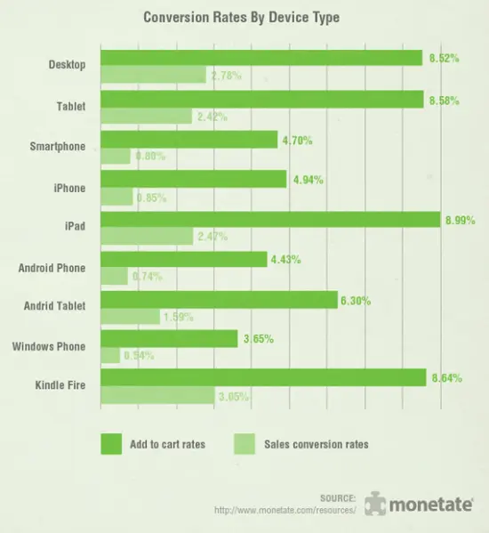
Conversion rates on tablets are higher than on smartphones
According to Appticles, conversion rates are still the highest offline, with 82% of customers choosing to purchase in-store, with45% on home desktop or tablet and 17% on mobile phone. In other words:readers usingtablet may be more likely to make a purchase via email than those using a smartphone.
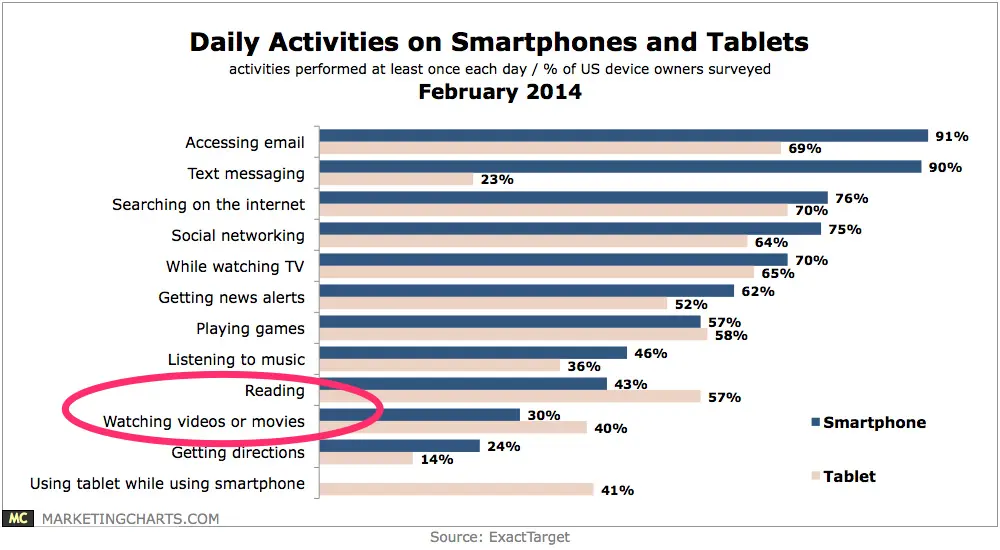
Users engage in more reading and watching on tablets
Not surprisingly, tablet users are more likely to be found reading or watching content on their devices, according to research by ExactTarget. The data suggeststhat tablet owners may "view their devices more as entertainment hubs, while smartphone owners are more likely to use them as information sources."
What does all this mean for email design? Read on.
An important note: the value of segmentatio
Before we go further, it's important to note that UK readers are much more likely to read email on tablets than their US counterparts. Mediapost reports that a massive 25% of emails are opened on tablets in the UK, compared to15% in the US.In other words, if you're thinking: all this information about tablet use is great, but does it apply to my list? The answer maydepend on the location of your reader base. It's so important to be strategic when collecting information about your readers so that you can segment send lists. That way, if you know a high portion of your readers are UK-based, you can design a tablet-optimized email versions for that group and test the results. Read more about segmentation here.
So what does all this mean for tablet email design?
Given what we know about tablet usage, we can make some inferences about how to best tailor email design for tablet reading. While thereisn't a magic formula, here are some valuable considerations to make in your tablet email design.
Tip #1: Make purchases easy (with live shopping carts and/or great CTA buttons)
We know that tablet users may be more likely to make a purchase on their device compared to smartphone users. So, as email designers, we can make sure an email's add-to-cart or purchase process is seamless.As we noted in our guide to email interactivity post, image carousels and product tours in emails allow readers to tap on images and buttons to get more information. Instead of waiting for a landing page to load, readers have exploratory power at their fingertips. This kind of in-email browsing may have the potential togo a lot further on tablets than on smart devices.Here’s an example of in-email photo browsing from Rebelmail:
Even though tablet screens are bigger than smartphone screens, buttons must still be designed to be tapped with a finger. So to get those conversions rolling, make sure your CTA buttons are bulletproof, pass the squint test, and have action-oriented text! Oh, and optimize the color, too.
Tip #2: Get interactive with your content
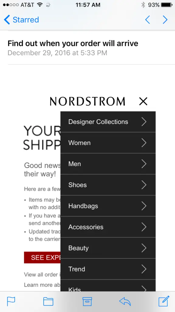
Because tablet users seem more likely to spend time with your content than smartphone readers, you have an opportunity to get interactive. This may mean making email browsing easier with a hamburger menu, which Nordstrom offers in an email:
Or, it may mean offering different types of content, like anin-email video. With Apple’s launch of iOS 10 last fall, HTML5 video can be viewed on iPad and iOS Mail, playing within the email.For brands with blogs or newsletters, you could also consider providing more content directly in email. For content-rich emails, you can improve navigability by includinganchor linksand by following newsletter design best practices. And, your content doesn't have to be strictly text-based. Longer emails could also include responsive photo galleriesor in-email surveys. Get creative!
Tip #3: Apply mobile-optimization best practices
While readers may treat tablets more like laptops than smartphones, emails still perform best on tablets when they're mobile-optimized. This means you should still be mindful of the best practices for mobile email design:
Smaller image file sizes (allowing for quicker load times)
High-contrast design for mobile screens set to low brightness
A mix of text and images (avoid using only images in emails, and make sure to use great ALT text description)
Design your tablet-ready email and go Pro!
Have you ever designed an email campaign specifically for tablet readers? Let us know the considerations you made. Lucky for us, all emails created in the BEE editor are always 100% responsive, making it a greatplatform for tablet-focused design. You don't even need to know HTML! Learn more and sign up for a BEE Pro free trial.
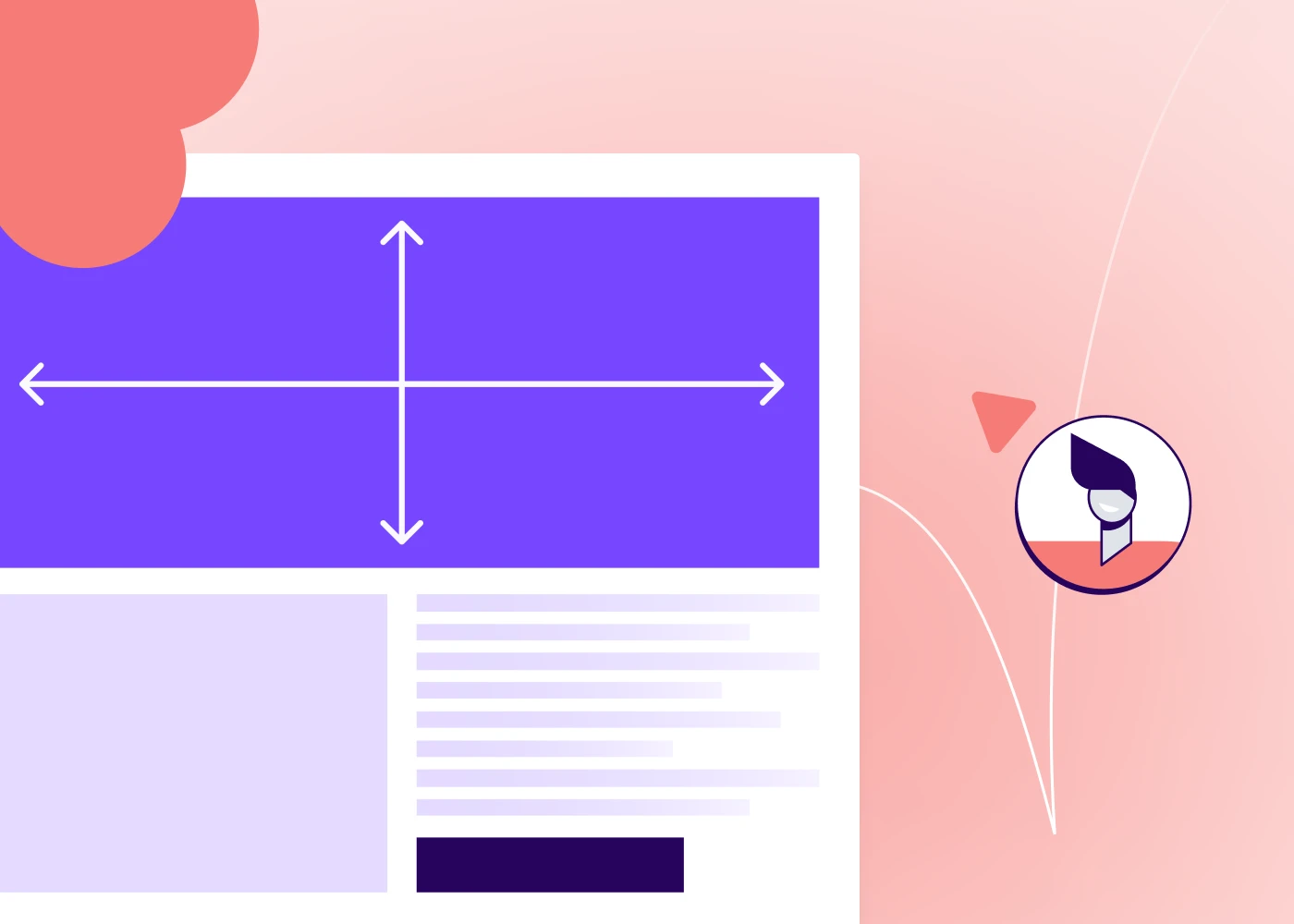
Discover the perfect email banner size for your campaign with our comprehensive guide, including design tips, best practices, and inspiration to enhance your emails.
Every marketer knows that branding, visually engaging branding, matters. In a recent HubSpot survey, 20% of marketers reported to see a direct correlation between their design choices and an increase in email engagement.
In email marketing specifically, one of the first design elements a recipient views is your banner, making it crucial to grab the attention of the reader at first glance. An email banner should effectively convey your message, resonate with your audience, and be responsive regardless of what device your recipient uses to view your emails.
Let's discuss email banner best practice to follow that will ultimately lead to improve results of your email campaigns.
What is an email banner?
An email banner is a strategic design element element that appears at the top of your emails to catch the immediate attention of your reader. Sometimes called an email header, your banner is where you’ll introduce the main purpose of your email, like that amazing sale you’re advertising or the product launch of the century, and reel in customers’ so they scroll through the rest of the email.
Your email banner is your chance to make a fantastic first impression. Let’s explore the best email banner sizes and best practices to keep in mind.
Ideal email banner sizes
It is an outdated solution to automatically set all email banners to a width of 600px. With screen sized of both mobile and desktop devices varying so widely, it's important to ensure your email banner size is responsive for optimal viewing experience.
For desktop users, a banner 650-700 pixels wide and 90-200 pixels tall is ideal
For mobile users, the ideal banner is 350 pixels wide and up to 100 pixels tall
These updated dimensions follow responsive design best practices allowing email banners to render properly in a variety of email clients and devices. Responsive design allows your email design to automatically adjust to the screen size of a customer’s device.
PRO tip: using an email design template that is already built to be responsive makes following this best practice a breeze.
Impact of email banner size on campaign performance
A banner that’s poorly sized could become distorted when customers open it in their Gmail, Outlook, or whatever email platform they use.
This makes your email look less professional and it can also be harder to read so it doesn’t get your message across as well. A poorly sized email banner can also affect the user experience. If the banner is too wide, for example, it forces customers to scroll horizontally and it doesn’t allow them to see the entire banner in one view.
Not only do these issues affect the overall experience customers have with your email but they can also squander the excellent engagement opportunity that a well-designed email banner can be. According to Opensense's data, email banners can have 5-10% engagement rates, a significant enhancement compared to the average click-through rate of 1.4% in emails.
Best practices for email banner design
Your banner size is an important part of designing an effective email banner, but it’s one of many. Check out these best practices to make your email banner even more powerful in garnering the engagement of your recipients.
File size: Any image in your email, but specifically your email banner, should be of high-quality. The ideal image should be download as a PNG at a resolution of 72dpi at 40kb or below.
Inverted pyramid: This "rule" in email design relates to adding the most important information at the top, working your way down to the least important information. When designing your email banner, make sure it clearly communicates the most important message in your email.
Brand consistency: As important as it is that your email banner makes a positive impression and communicates the main purpose of your email, it also should align with your brand. Make sure the design uses your brand colors, logo, or other aspects that make it consistent with your brand’s visual identity.
Text: Your banner needs to communicate your message, but less is more. Keep your copy sparse so it isn’t visually overwhelming and so the focus stays on your core intention. Ideally, 45-75 characters on a line is the sweet spot.
Email-friendly fonts: Make sure you use email-safe fonts that render reliably on major email platforms.
Accessibility: You want your banner’s message to reach as many customers as possible, and that includes customers with disabilities. Make sure to include accessibility features like using alt text so viewers with visual impairments can understand your message and using color combinations that viewers with color blindness can see.
Interactivity: Your email banner doesn’t have to be just a plain image or text. Consider making it interactive, such as with a GIF or a video that grabs your viewers’ attention.
Testing: You can follow all the rules for proper email banner size and design, but it’s still important to test it in action to make sure it shows up the way you want it to. Always send yourself a test email and see how that test email looks on different devices and platforms before you send it to your subscriber list.
For inspiration, check out these excellent email banners. This one from Beefree's template catalog clearly communicate the purpose of the email, remains consistent in branding throughout and plays with visual and text hierarchy to guide the reader's eye.
This other email banner uses a navigation bar to keep the reader in the brand's ecosystem allowing readers to learn more about the marketing agency. This simple, yet effective email header communicates clearly the purpose of the email using imagery and text and has a clear CTA to lead the reader to complete the desired action without needing to scroll.
When creating a strong email banner, it’s just as important to avoid doing the wrong things as it is to do the right things. Watch for these common pitfalls in email banner design:
Over-designing: Your email banner is prime real estate in your email, so of course you want to make the best use of that real estate. If you try to cram too much into that banner, though, you may lose your core message entirely because viewers don’t know where to look.
Hard-to-read fonts: Your email banner is a wonderful place to get creative and build visual appeal, so of course you want to use fun design elements and fonts. But at the end of the day, the purpose is to send a message, so make sure the ornamental fonts you use are still clear enough that they’re easy to read.
Lack of responsive design: We’ve touched on this above but it’s also a common misstep that’s worth mentioning. Considering that 46% of emails are opened on mobile devices, every email and banner you create must be responsive to maintain its visual quality on any email platform.
Leveraging Tools for Email Marketing Banner
There’s a lot to consider as you’re designing an email banner, but we have great news: there are tools that can make it easier.
Take Beefree for example. Our extensive email template library has over 1,700 pre-built templates that already use banner design best practices like responsive design, minimal text for maximum impact, and proper sizing. Our HTML email editor makes it easy to customize these designs for your brand and messaging.
I’ve been a fan for years. There’s nothing like seeing fantastic messages designed by some of the world's best brands to inspire you. Perhaps as well-known as the website are the newsletters from Really Good Emails: witty, funny, and packed with great articles and best practices.
So when Mike Nelson, one of the founders of Really Good Emails (RGE), reached out to me months ago, I was all ears.
Mike and his partners had been volunteering their time on the RGE project for almost ten years and had decided that it was time to switch gears. To deliver more value to their millions of visitors, RGE needed more time, money, and full-time focus.
One thing they found in surveys is that RGE users wanted to “turn saved emails into customizable templates” and use them in any email tool. As it turns out, that’s exactly what people do with Beefree’s no-code email builder: create millions of emails monthly for all sorts of use cases in virtually every industry. They even create those emails inside hundreds of other applications where our tools are embedded.
Mike clearly had the right idea, and I’m so glad he and his co-founders reached out.
We started talking and sharing ideas and a vision for the future of RGE. There was a lot of alignment. We believed then—and even more strongly today—that a collaboration between RGE and Beefree could make the art and science of email creation more accessible, more inspiring, and simply, more fun.
Our plans for the future
If you’re an RGE fan and have never heard of Beefree, our goal is to shorten your path from inspiration to creation. Over the next several months, we will work on various ways to make that happen.
If you’re a Beefree fan, we will add more inspiration to your email design process. You’ve seen the 1,700+ templates in our catalog. Now, we’ll leverage the 15,000+ designs on the RGE site to give you creative superpowers.
If you’re involved in email creation at all, the key point is this: by bringing together RGE's vast email catalog with Beefree's intuitive design tools, we will provide new ways for you to close the gap between finding inspiration and creating something valuable from it.
I've always believed that inspiration is the precursor to creation. Seeing a design that clicks with you, that sparks that "Aha!" moment, is crucial. And Really Good Emails has been that source of "Aha!" for many, including myself. Incorporating RGE's treasure trove into Beefree's ecosystem feels like a natural step toward enhancing the creative process for our community.
Bringing Beefree and RGE together
From a product point of view, you will start seeing integrations between RGE and Beefree. We’ll start small and get fancier over time. They will start shipping soon, and we’ll keep you posted.
While that’s in the future, there are things we can deliver to you today.
First, the Pro features on reallygoodemails.com become FREE for all, starting immediately. At Beefree, we love removing friction and agreed with our friends at RGE to start there. So, create new collections, add your favorite emails, and use the Chrome extension. It’s all free now.
Secondly, Unspam is back. It was hard for an all-volunteer team to host and grow this special email event. We have zero intention of changing the nature and objectives of the event, but we’re excited to support it and help it grow. Justine Jordan - Head of Strategy & Community at Beefree - took the lead on that, co-hosting Unspam 2024 in her own, authentic way.
Third, I'm super excited to welcome Mike Nelson and Matt Helbig from RGE to the Beefree team. They have a lot of innovative ideas around the future of Really Good Emails, and we can’t wait to collaborate with them. Matthew Smith and Matt Cook will help as strategic advisors.
We live in a world where email continues to be the favorite channel for companies to communicate with their subscribers and for people like you and I to hear from our favorite brands (e.g., here and here). In this world, you - email creators - play such a crucial role.
You are the key stakeholders for both RGE and Beefree. Hundreds of thousands of you use our tools every month. Through Unspam and many other initiatives, we want to increase investment in email makers and creators.
We need to do so to continue building products that make sense and are truly helpful: successful products only come from a lot of deep listening. We want to do so because we are part of the same community, and there’s no healthy RGE & Beefree without a thriving community.
I know it’s cliché to say it, but we truly believe this is a case where the whole has a real chance of being greater than the sum of the parts. Our tools - combined - will deliver a greater amount of value to you. Our efforts - combined - will have a greater impact.
Give us a bit of time to execute all of this, and keep us honest as we do so. If you have questions, we maintain a FAQ here and welcome your comments and feedback by emailing community@beefree.io.
With heartfelt enthusiasm, optimism, and anticipation for what’s to come,
Delve into the email marketing best practices that can empower digital agencies to harness the full potential of emails. From crafting compelling content to leveraging automation and segmentation, these practices are essential for driving engagement, nurturing leads, and achieving remarkable results
For fast-paced digital marketing agencies, it's common to focus on nurturing and expanding your clients' businesses, that you leave little room to promote your own services. While this is unintentional, this oversight may be hindering your agency's growth potential.
That's where email marketing comes in as a game-changer forbusy agencies. With email creation becoming more intuitive, powerful, and 37% of brands increasing their email budgets it's clear to see that email continues to grow as an effective marketing solution.
Let's delve into the best practices that can elevate your agency's email marketing game and unlock new avenues of success.
Why email marketing benefits digital marketing agencies
With 4.3 billion email users, email continues as a sustainable, cost-effective, and high-converting solution to effortlessly balance client acquisition and client retention.
This single strategy enables targeted outreach to engage and move audiences through different stages of the buyer's journey. For new audiences, email marketing can be used to show them your work, promote services, and reasons to work with you. For customer loyalty and retention, email can be used to upsell and/or communicate the consistent value you bring to your clients.
Email marketing presents a lucrative opportunity for marketing agencies of all sizes to thrive and grow. By consistently engaging potential clients and ensuring your presence remains prominent, you establish top-of-mind recall for marketing services.
#1: Segmentation to keep the balance
As your organization grows, you will notice that your audience has a wide range of interests depending on their demographics, business, and needs. Segmentation involves dividing your email list into different groups based on specific criteria, such as industry or stage in your client acquisition journey.
Segmentation enables you to send targeted and personalized content to each group, increasing the relevance and effectiveness of your campaigns and ROI. For example, if you have a segment of subscribers who are interested in social media marketing, you can tailor your emails to provide them with valuable tips and resources in that area.
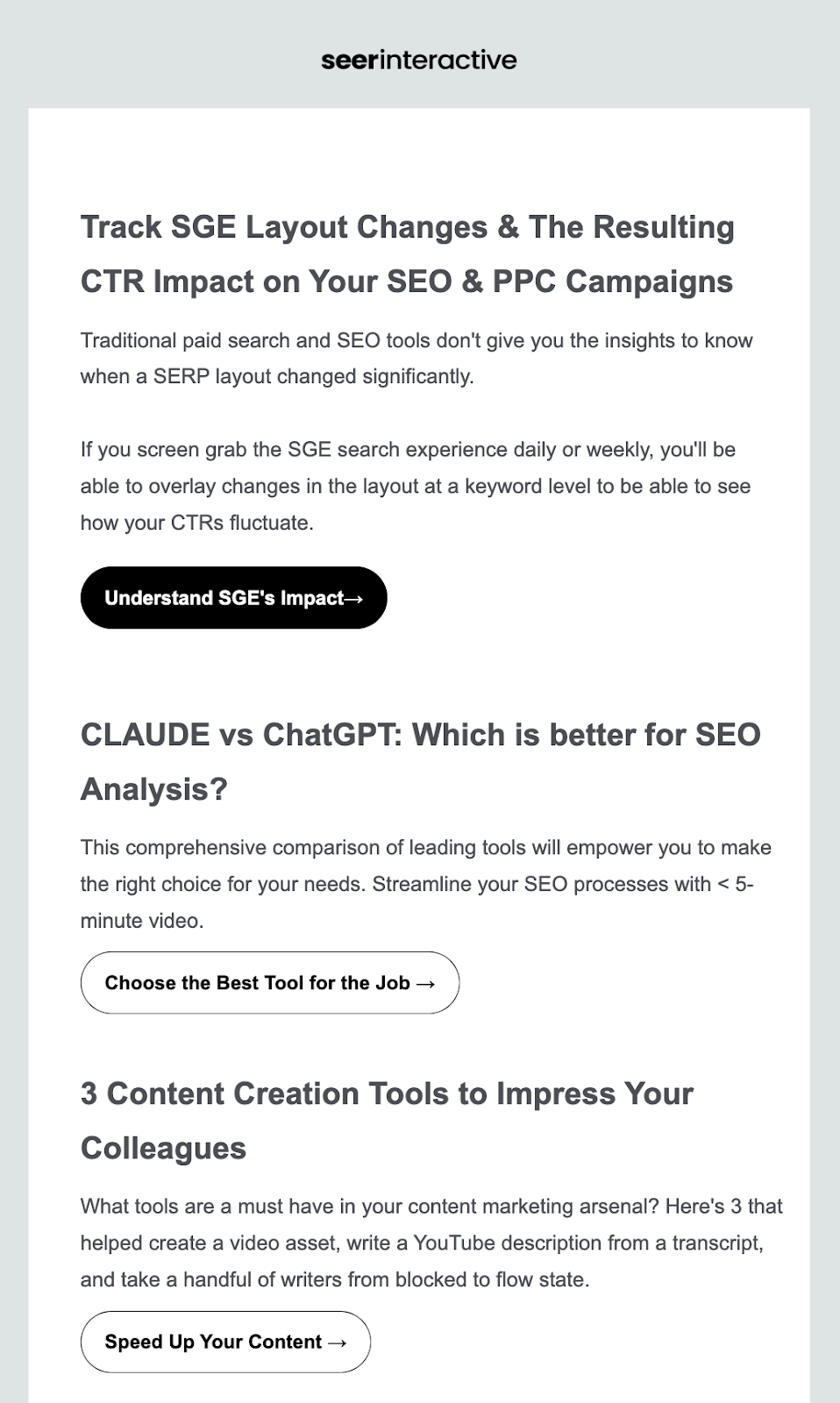
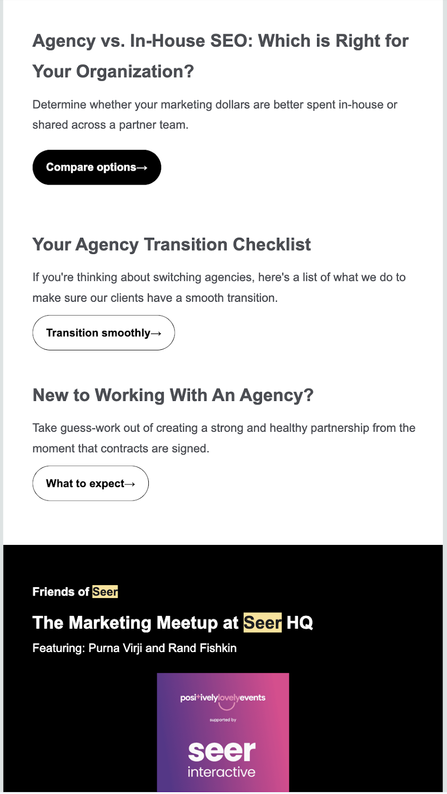
Seer Interactive, for instance, is a digital marketing agency serving a variety of audiences from digital marketers who need to stay up to date on best practices to prospective customers. You can see in the example below how Seer differs their emails based on the audience.
Email for digital marketers:
Focuses on speaking to digital marketers who are interested in learning more about how to improve their services, what's new in the industry, and new tools and solutions.
Email for potential clients:
The second email targets potential clients who are likely in the discovery phase of what an agency does. Seer provides some insights to help the reader make more informed decisions with comparisons, a checklist, and an article with what to expect. This email, while does not directly promote Seer's services, let's the reader know that this agency is here to help keeping them top of mind.
Segmenting your audience using the customer journey funnel
As mentioned earlier, one of the most beneficial aspects of email marketing for agencies is the ability to maintain balance between client acquisition and customer retainment. In our professional experience, the best way to do this is to map out your customer journey and plan out how each stage serves your audience and of course moves them through the journey. While your client’s journey may vary depending on your services, but typically it entails the following:
Awareness: In this stage, prospects have heard your name but are just getting to know who you are. This is where you can create a sequence of emails for them to get to know your agency, the services you offer, and what makes you unique.
Consideration: This audience is weighing their options about the best marketing agency for them. This is where you will likely begin to provide statistics about the returns you’ve achieved for other clients or share testimonials.
Decision/conversion: This is the stage when prospects just need that final push to take action and sign on as clients. In this stage, you can offer incentives or a free trial of one services.
Loyalty: This is the stage when a business has signed on as a client or made a purchase and your goal is to retain them. You’ll want to send these clients loyalty-boosting content like announcements about new products, appreciation for their support, and informative content that is helpful to them.
Ultimately, segmentation is a great way to keep your subscribers engaged and drive client acquisition and retention. Once you have a clear understanding of your client journey and the goals at each stage, now it's time to grow your email list.
#2: Building and growing your email list
To maximize the effectiveness of your email marketing campaigns, it is essential to first start building a quality list of people who are interested in what you have to offer and say.
Make it easy to subscribe: Whether you're using a form on your website or a landing page, make sure that your process is simple. Only ask for only essential information, ideally only up to three. Some suggestions are name, email address, and a question that could help you segment them into groups such as "are you looking for an agency?" This simple question could help segment new subscribers to cold vs. hot leads. Don't forget to use a clear CTA that communicated what the next step is.
Leverage social media: Promote your email list on social media platforms like Facebook, Instagram, Tik Tok, and Twitter/X to reach a wider audience and encourage sign-ups.
Offer valuable incentives: Provide something of value, such as appealing discounts on a client’s first service or exclusive content like a guide to social media marketing in exchange for people signing up to your email list.
Regularly clean your list: While building and growing your email list, it is important to regularly examine your subscribers and remove those who are not engaging. This helps maintain a healthy list and ensures that your metrics accurately reflect subscriber engagement.
Don’t forget existing clients: Add your existing clients to your mailing list so they can stay up to date on your latest services and offers. Additionally create a segment of former clients who have not engaged with your agency in a while. This segment is perfect for targeted emails meant to re-engage them, like personalized information about where they left off in the process and a call-to-action button for them to jump back in.
Provide compelling content consistently: Deliver content that is interesting, informative, and valuable to keep subscribers engaged and to make them more likely to tell others about your mailing list. The friends they tell may become subscribers and eventually clients.
Keep these best practices in mind to build a high-quality subscriber list who are genuinely interested in your brand.
#3: Designing high-converting emails
The effectiveness of your email campaigns is directly influenced by the design choices you make. Research shows that visually appealing designs can significantly enhance engagement rates.
Email design best practices
Strategic design choices not only make your emails more appealing, but also drive higher conversions.
Personalize your emails: HubSpot ranks message personalization as one of the most effective strategies for email marketing. Tailor the content based on their interests or past interactions with your brand, such as by including a section for recommended services. This increases engagement and makes your emails more relevant.
Use professional and high-quality visual design: Use high-quality images and graphics that support your message and reflect your brand's identity. A visually appealing email is more likely to capture attention and encourage click-throughs. In fact, according to Campaign Monitor, communications with visuals receive 650% more engagement than those without.
Include a clear call-to-action (CTA): Wordstream found that one CTA in your email can garner 371% more clicks and over 1600% higher sales. Your CTA should be prominent, concise, and action-oriented. Make it easy for recipients to understand what they need to do next, whether it's making a purchase, signing up for an event, or downloading a resource.
Maintain consistent branding: Ensure that your email templates align with your brand's colors, fonts, and overall visual style. Consistency helps build recognition and reinforces trust with your audience, and according to GaggleAMP, customers who feel connected to your brand account for 37% of revenue and spend twice as much.
Design for mobile devices: According to eMarketer, over half of emails are opened on mobile devices. Be sure your emails are mobile-friendly so they still look clean and engaging for your recipients.
Leverage email templates
Email marketing templates are a great asset for your email design. Many email marketing tools offer pre-designed emails that you can easily customize to suit your needs and brand guidelines.
By using pre-built templates, your agency can significantly reduce the time and effort required to create engaging emails, ultimately boosting your return on investment (ROI) by maximizing the impact of your email marketing efforts.
Ensure responsive, mobile-optimized, HTML email design
When designing your marketing emails, designing in HTML helps ensure that your emails will be readable in nearly any email app (like Gmail, Outlook, and so on) and device. Fortunately, you don’t have to be an HTML coder to create HTML emails.
Now a days, there are many tools that offer an easy-to-use design interface so you can design your emails and export the HTML the solution builds for you. These tools, streamline and make the design process more efficient, without the need to have any knowledge on HTML or CSS.
By utilizing an HTML email design tool, such as Beefree, not only can you enjoy the peace of mind that your emails will render well, but you also benefit from a solution that helps you and your agency save time, increase productivity, and get more done with less resources.
However, not all HTML email builders are made equal.
#4: Choosing the right email marketing software for your agency
A stellar email campaign starts with effective and productive email marketing software. When choosing email marketing software, it's important to consider factors such as ease of use, customization options, integration capabilities with other tools, and more.
Factors to consider when choosing email marketing software
How do you determine which of the many email marketing tools is the best fit for your agency’s needs? Here are some important factors to consider while you weigh your options:
Check out the features: Every software has its own collection of features like scheduled sending, automated options for sending a series of emails, personalization, design capabilities, and so on. Compare tools and their features against your list of must-haves.
Examine the pricing: Cost matters in your ROI. Pick a service that fits your budget.
Consider other capabilities: Some tools offer email marketing along with other helpful services like social media ads, website analytics, and so on. Consider whether there are email marketing tools that will also replace some of your other software.
Try A/B testing: If you’re able to try out multiple email tools at the same time, consider sending a few campaigns with each tool to see if one performs better than the other.
Weigh the integration capabilities: Consider email marketing platforms that may integrate with some of the other tools you use, like your client management system. This applies to email tools that integrate with other email tools too, like BeeFree which provides a user-friendly way to design your emails and smoothly send them with nearly any email sending platform
Preview emails: Check out examples of what other businesses have created using each email tool.
Read reviews and research: See what other businesses (and especially other marketing agencies, if possible) have to say about each tool.
Recommended email marketing tools
Here's a quick rundown of some recommended email design tools that can help maximize your ROI:
Benefits: Targeted emails improve ROI and overall marketing strategy. HubSpot's AI can help with segmentation and crafting tailored emails for each recipient.
Benefits: ActiveCampaign is ideal for businesses with a focus on customer relationships. It offers extensive automation and tracking capabilities for a more personalized approach.
Beefree
Key features: Specializing in HTML email design, with an extensive catalog of email templates to use and a drag-and-drop email editor for complete customization
Benefits: While emails cannot be exported via Beefree like the above, Beefree integrates with all major email sending platforms for easy use with your favorite software. Additionally, the application offers free and cost-effective plans to help you get started.
To ensure you're choosing the right tool, consider your organization's unique needs, the tool's capabilities, and how well it integrates with your existing marketing tech stack.
#5: Automating Your email marketing efforts
Leveraging automation in your email marketing strategy can significantly enhance your outreach efforts and improve your email marketing ROI. By automating certain aspects of your email campaigns, you can ensure timely and targeted communication with potential clients, increasing the likelihood of engagement.
Automation allows you to schedule emails to be sent at optimal times and personalize content based on user behavior. This not only saves time and resources but also maximizes the impact of your emails. There are several ways that your agencies can incorporate automation, but here are some:
Sending an email to clients who started but didn’t complete your inquiry process.
Automated welcome series for new clients that introduces them to your work process.
Automated follow-ups for webinars, events, or meetings.
Benefits of email marketing automation
Increased efficiency: With automated emails, you can reach a larger number of clients or reach clients more reliably without having to manually send individual emails.
Engagement and lead nurturing: Marketing automation sometimes offers advanced features like lead scoring and nurturing. You can segment your audience based on their behavior or interests, ensuring that they receive relevant content tailored specifically for them.
Advanced user segmentation: Automation allows you to segment your email list based on various criteria such as demographics, purchase history, or engagement level. This enables you to send personalized messages that resonate with each segment of your audience.
Increased conversions: By sending targeted and timely emails through automation, you can significantly improve conversion rates. Whether it's encouraging a purchase or promoting an upcoming event, automated emails can help drive more conversions for your agency.
#6: Tracking and measuring for success
To ensure the effectiveness of your email marketing efforts, it is crucial to track and measure key metrics such as open rates, click-through rates, and conversion rates. This data helps you recognize trends, such as what designs or content resonate the most with your clients, and help make informed decisions for your next campaign.
Important metrics to track
Here are some key metrics that you should track throughout your agency’s email marketing campaigns.
Open rate: Shows the percentage of recipients who opened your email out of those who received it. It gives insight into the effectiveness of subject lines and sender names.
Click-through rate: Measures the percentage of recipients who clicked on a link within your email. It helps you evaluate the effectiveness of your email content and call-to-action.
Conversion rate: Tells you how many recipients took the desired action after clicking through your email. In the case of a marketing agency, that action could be filling out your website’s contact form.
Bounce rate: Tracks the percentage of emails that were not delivered to recipients' inboxes due to invalid or non-existent email addresses.
List growth rate: Allows you to assess how quickly your email list is expanding so you can adjust your acquisition strategies accordingly.
Email sharing/forwarding rate: Measures how often recipients share or forward your emails to others. It can indicate whether your content resonates with your audience and has potential for increased reach.
Unsubscribe rate: Monitors the percentage of recipients who unsubscribe from your emails after receiving them. High unsubscribe rates may indicate issues with targeting, content relevance, or frequency.
Unlocking the power of email marketing for agencies
Digital marketing agencies have a unique business model and a unique use for email marketing. Unlike many businesses, you aren’t trying to use your email marketing to make a quick sale or appeal to impulse buyers. You’re trying to establish a genuine and ongoing connection with potential clients and show them the concrete value you can bring to their businesses. Agency-specific strategies like those above can help you make the most of every email you send.
Want a more efficient way to create compelling marketing emails? The Beefree "Business" plan is the perfect solution for growing agencies to scale their email marketing processes and campaigns. Start your free 15-day Business trial today!
1. How can email marketing help digital agencies maximize their ROI?
Email marketing helps digital agencies maximize their ROI by allowing them to reach a targeted audience, build relationships with clients, and drive traffic to their website or landing page.
2. What are some best practices for email marketing in digital agencies?
Some best practices for email marketing in digital agencies include segmenting the audience according to interests or needs and other factors, personalizing emails, creating compelling subject lines and content, optimizing for mobile devices, and analyzing campaign data to make improvements.
3. How often should digital agencies send emails to their subscribers?
The frequency of sending emails will depend on factors such as the industry, target audience, and goals of the campaign. However, it is generally recommended to maintain a consistent schedule that provides value without overwhelming subscribers.
4. What metrics should digital agencies track to measure the success of their email marketing campaigns?
Digital agencies should track metrics such as open rates, click-through rates (CTRs), conversion rates, bounce rates, and unsubscribe rates to measure the success of their email marketing campaigns.
5. Are there any legal considerations when conducting email marketing for digital agencies?
Yes, there are legal considerations when conducting email marketing. Digital agencies need to comply with anti-spam laws like the CAN-SPAM Act in the United States and GDPR in Europe by including clear opt-in/opt-out options, providing accurate sender information in each email sent, and following other guidelines.
Discover the perfect email banner size for your campaign with our comprehensive guide, including design tips, best practices, and inspiration to enhance your emails.
Every marketer knows that branding, visually engaging branding, matters. In a recent HubSpot survey, 20% of marketers reported to see a direct correlation between their design choices and an increase in email engagement.
In email marketing specifically, one of the first design elements a recipient views is your banner, making it crucial to grab the attention of the reader at first glance. An email banner should effectively convey your message, resonate with your audience, and be responsive regardless of what device your recipient uses to view your emails.
Let's discuss email banner best practice to follow that will ultimately lead to improve results of your email campaigns.
What is an email banner?
An email banner is a strategic design element element that appears at the top of your emails to catch the immediate attention of your reader. Sometimes called an email header, your banner is where you’ll introduce the main purpose of your email, like that amazing sale you’re advertising or the product launch of the century, and reel in customers’ so they scroll through the rest of the email.
Your email banner is your chance to make a fantastic first impression. Let’s explore the best email banner sizes and best practices to keep in mind.
Ideal email banner sizes
It is an outdated solution to automatically set all email banners to a width of 600px. With screen sized of both mobile and desktop devices varying so widely, it's important to ensure your email banner size is responsive for optimal viewing experience.
For desktop users, a banner 650-700 pixels wide and 90-200 pixels tall is ideal
For mobile users, the ideal banner is 350 pixels wide and up to 100 pixels tall
These updated dimensions follow responsive design best practices allowing email banners to render properly in a variety of email clients and devices. Responsive design allows your email design to automatically adjust to the screen size of a customer’s device.
PRO tip: using an email design template that is already built to be responsive makes following this best practice a breeze.
Impact of email banner size on campaign performance
A banner that’s poorly sized could become distorted when customers open it in their Gmail, Outlook, or whatever email platform they use.
This makes your email look less professional and it can also be harder to read so it doesn’t get your message across as well. A poorly sized email banner can also affect the user experience. If the banner is too wide, for example, it forces customers to scroll horizontally and it doesn’t allow them to see the entire banner in one view.
Not only do these issues affect the overall experience customers have with your email but they can also squander the excellent engagement opportunity that a well-designed email banner can be. According to Opensense's data, email banners can have 5-10% engagement rates, a significant enhancement compared to the average click-through rate of 1.4% in emails.
Best practices for email banner design
Your banner size is an important part of designing an effective email banner, but it’s one of many. Check out these best practices to make your email banner even more powerful in garnering the engagement of your recipients.
File size: Any image in your email, but specifically your email banner, should be of high-quality. The ideal image should be download as a PNG at a resolution of 72dpi at 40kb or below.
Inverted pyramid: This "rule" in email design relates to adding the most important information at the top, working your way down to the least important information. When designing your email banner, make sure it clearly communicates the most important message in your email.
Brand consistency: As important as it is that your email banner makes a positive impression and communicates the main purpose of your email, it also should align with your brand. Make sure the design uses your brand colors, logo, or other aspects that make it consistent with your brand’s visual identity.
Text: Your banner needs to communicate your message, but less is more. Keep your copy sparse so it isn’t visually overwhelming and so the focus stays on your core intention. Ideally, 45-75 characters on a line is the sweet spot.
Email-friendly fonts: Make sure you use email-safe fonts that render reliably on major email platforms.
Accessibility: You want your banner’s message to reach as many customers as possible, and that includes customers with disabilities. Make sure to include accessibility features like using alt text so viewers with visual impairments can understand your message and using color combinations that viewers with color blindness can see.
Interactivity: Your email banner doesn’t have to be just a plain image or text. Consider making it interactive, such as with a GIF or a video that grabs your viewers’ attention.
Testing: You can follow all the rules for proper email banner size and design, but it’s still important to test it in action to make sure it shows up the way you want it to. Always send yourself a test email and see how that test email looks on different devices and platforms before you send it to your subscriber list.
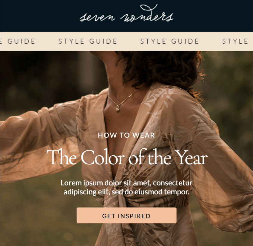
For inspiration, check out these excellent email banners. This one from Beefree's template catalog clearly communicate the purpose of the email, remains consistent in branding throughout and plays with visual and text hierarchy to guide the reader's eye.
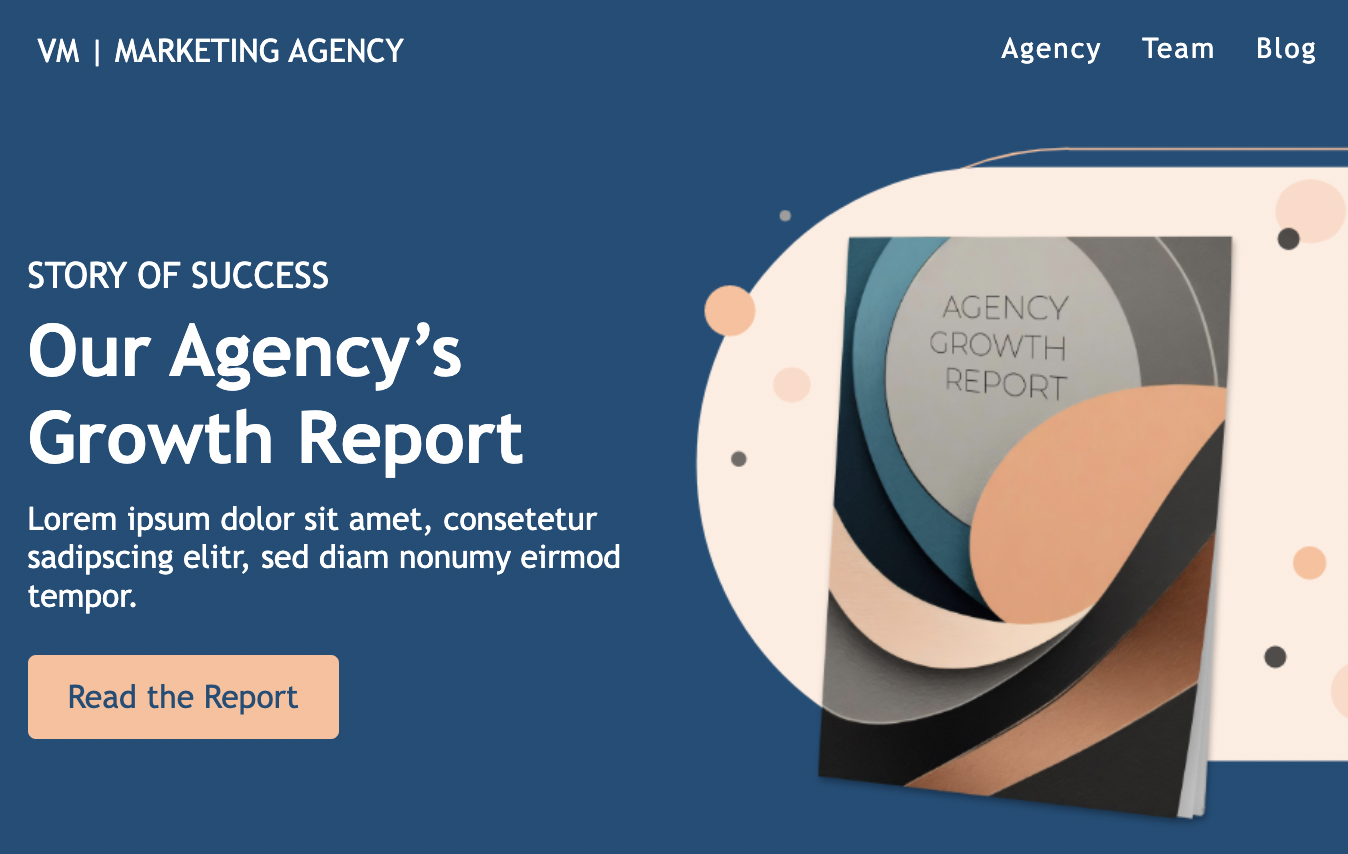
This other email banner uses a navigation bar to keep the reader in the brand's ecosystem allowing readers to learn more about the marketing agency. This simple, yet effective email header communicates clearly the purpose of the email using imagery and text and has a clear CTA to lead the reader to complete the desired action without needing to scroll.
When creating a strong email banner, it’s just as important to avoid doing the wrong things as it is to do the right things. Watch for these common pitfalls in email banner design:
Over-designing: Your email banner is prime real estate in your email, so of course you want to make the best use of that real estate. If you try to cram too much into that banner, though, you may lose your core message entirely because viewers don’t know where to look.
Hard-to-read fonts: Your email banner is a wonderful place to get creative and build visual appeal, so of course you want to use fun design elements and fonts. But at the end of the day, the purpose is to send a message, so make sure the ornamental fonts you use are still clear enough that they’re easy to read.
Lack of responsive design: We’ve touched on this above but it’s also a common misstep that’s worth mentioning. Considering that 46% of emails are opened on mobile devices, every email and banner you create must be responsive to maintain its visual quality on any email platform.
Leveraging Tools for Email Marketing Banner
There’s a lot to consider as you’re designing an email banner, but we have great news: there are tools that can make it easier.
Take Beefree for example. Our extensive email template library has over 1,700 pre-built templates that already use banner design best practices like responsive design, minimal text for maximum impact, and proper sizing. Our HTML email editor makes it easy to customize these designs for your brand and messaging.
I’ve been a fan for years. There’s nothing like seeing fantastic messages designed by some of the world's best brands to inspire you. Perhaps as well-known as the website are the newsletters from Really Good Emails: witty, funny, and packed with great articles and best practices.
So when Mike Nelson, one of the founders of Really Good Emails (RGE), reached out to me months ago, I was all ears.
Mike and his partners had been volunteering their time on the RGE project for almost ten years and had decided that it was time to switch gears. To deliver more value to their millions of visitors, RGE needed more time, money, and full-time focus.
One thing they found in surveys is that RGE users wanted to “turn saved emails into customizable templates” and use them in any email tool. As it turns out, that’s exactly what people do with Beefree’s no-code email builder: create millions of emails monthly for all sorts of use cases in virtually every industry. They even create those emails inside hundreds of other applications where our tools are embedded.
Mike clearly had the right idea, and I’m so glad he and his co-founders reached out.
We started talking and sharing ideas and a vision for the future of RGE. There was a lot of alignment. We believed then—and even more strongly today—that a collaboration between RGE and Beefree could make the art and science of email creation more accessible, more inspiring, and simply, more fun.
Our plans for the future
If you’re an RGE fan and have never heard of Beefree, our goal is to shorten your path from inspiration to creation. Over the next several months, we will work on various ways to make that happen.
If you’re a Beefree fan, we will add more inspiration to your email design process. You’ve seen the 1,700+ templates in our catalog. Now, we’ll leverage the 15,000+ designs on the RGE site to give you creative superpowers.
If you’re involved in email creation at all, the key point is this: by bringing together RGE's vast email catalog with Beefree's intuitive design tools, we will provide new ways for you to close the gap between finding inspiration and creating something valuable from it.
I've always believed that inspiration is the precursor to creation. Seeing a design that clicks with you, that sparks that "Aha!" moment, is crucial. And Really Good Emails has been that source of "Aha!" for many, including myself. Incorporating RGE's treasure trove into Beefree's ecosystem feels like a natural step toward enhancing the creative process for our community.
Bringing Beefree and RGE together
From a product point of view, you will start seeing integrations between RGE and Beefree. We’ll start small and get fancier over time. They will start shipping soon, and we’ll keep you posted.
While that’s in the future, there are things we can deliver to you today.
First, the Pro features on reallygoodemails.com become FREE for all, starting immediately. At Beefree, we love removing friction and agreed with our friends at RGE to start there. So, create new collections, add your favorite emails, and use the Chrome extension. It’s all free now.
Secondly, Unspam is back. It was hard for an all-volunteer team to host and grow this special email event. We have zero intention of changing the nature and objectives of the event, but we’re excited to support it and help it grow. Justine Jordan - Head of Strategy & Community at Beefree - took the lead on that, co-hosting Unspam 2024 in her own, authentic way.
Third, I'm super excited to welcome Mike Nelson and Matt Helbig from RGE to the Beefree team. They have a lot of innovative ideas around the future of Really Good Emails, and we can’t wait to collaborate with them. Matthew Smith and Matt Cook will help as strategic advisors.
We live in a world where email continues to be the favorite channel for companies to communicate with their subscribers and for people like you and I to hear from our favorite brands (e.g., here and here). In this world, you - email creators - play such a crucial role.
You are the key stakeholders for both RGE and Beefree. Hundreds of thousands of you use our tools every month. Through Unspam and many other initiatives, we want to increase investment in email makers and creators.
We need to do so to continue building products that make sense and are truly helpful: successful products only come from a lot of deep listening. We want to do so because we are part of the same community, and there’s no healthy RGE & Beefree without a thriving community.
I know it’s cliché to say it, but we truly believe this is a case where the whole has a real chance of being greater than the sum of the parts. Our tools - combined - will deliver a greater amount of value to you. Our efforts - combined - will have a greater impact.
Give us a bit of time to execute all of this, and keep us honest as we do so. If you have questions, we maintain a FAQ here and welcome your comments and feedback by emailing community@beefree.io.
With heartfelt enthusiasm, optimism, and anticipation for what’s to come,
Massimo Arrigoni
CEO, Beefree
Stay informed on all email trends
From the latest creative design strategies that inspire your next campaign to industry best practices and tech advancements, our newsletter is the go-to for all things creation.
By clicking Subscribe you're agreeing with our Privacy Policy