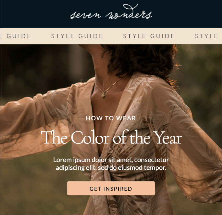
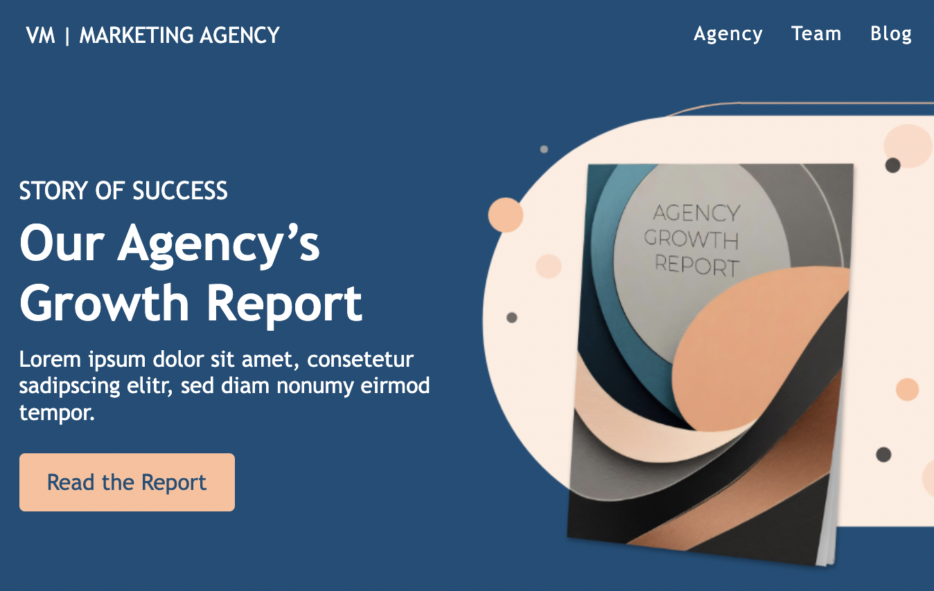
Eye-catching email headers set the tone for your email. Whether it’s bold or subtle, the header is where you announce yourself to the reader and immediately introduce a visual identity.
If you don’t normally give your email header design much thought, now’s the time to reconsider. Let’s break down what exactly an email header is and check out some design examples from brands in our inbox.
WHAT IS AN EMAIL HEADER?
An email header encompasses the subject line, recipient, and sender, as well as the HTML header in the body of the email. In this blog post, we’ll be discussing the part of the email header that’s inside the email.
Email headers include the company’s name or logo. They often add a product menu that links to the brand’s website. Sometimes, brands will also add a line about a perk they’re offering—such as free shipping or a discount.
Your header might seem unimportant, but it’s actually a great place to use some key marketing strategies. Think of it as a free space to insert essential marketing or branding information. You could also make the email easier to navigate by adding an anchor link menu in the header.
EMAIL HEADER DESIGN BEST PRACTICES
Well-designed email headers have a few key qualities in common. We suggest the following best practices:
- Make sure the header is brand-identifying. The header reinforces the “from” field so the reader won’t doubt who sent the email.
- Make sure the header is versatile. A good header works with all email campaign types, playing nicely with each email template.
- Remain consistent over time. A consistent email header creates familiarity, which reduces the cognitive drain on your readers.
Create an elegant and simple header. There should be no clutter in the header, like crammed information or hard-to-read print. Case in point: the Sweaty Betty header, seen here, that uses a basic font and includes only the essential information.

EMAIL HEADER DESIGN MISTAKES TO AVOID
As you design your email header, avoid the following pitfalls:
- Don’t overdo the navigation. A concise and clear navigation menu is helpful. A dozen choices are overwhelming. It’s an email, not your website.
- Don’t make it too big. Size is important—strive for your email headers to be less than 70px high if they don’t have a menu, or less than 200px if they do.
- Don’t go off-script. The header should be strongly branded, including your logo and key colors. Your email header is not the place to experiment with new, off-the-wall ideas.
- Don’t keep changing. If the design of your email header changes frequently, your emails will be less recognizable, causing some readers to wonder if it’s really you.
Now that you know what makes up the best email header design, let’s take a look at some email header ideas backed up with real-life examples from brands you know.
EMAIL HEADER IDEAS
#1: Just use your logo
Plenty of brands use a version of their logo in their header. There’s nothing wrong with that! Using your logo easily checks all three items on our to-do list: Your logo is branded, simple, and versatile.
If you include a navigation menu in your header — many brands, especially e-commerce companies, find these menus important — reduce clutter and streamline your header by using your brand name or logo at the top. Brands from Target to Crate & Barrel to West Elm all do this. Here’s the approach Hootsuite uses in its emails, inserting its logo and name before an introductory line of text:

When your logo is well-recognized, it gets easier and easier to use on its own. Here’s another example from Lululemon, with the logo on the left and a super-simple navigation menu on the other side.

Instacart is another brand that keeps its emails uncluttered by just using its logo and name at the top. The logo provides a little pop of color and immediately brands the email.

#2: Get colorful
Another simple, versatile way to create a great email header is to use a band of color across the top of your message. The header doesn’t have to be fancy. Just use your primary brand color and brand font, and voilà!
Here’s an example from Ghirardelli Chocolate. Ghirardelli chose a muted navy blue that matches its branding and isn’t overwhelming. Gold accents, the brand’s logo, and its motto set up the rest of the email. This email header design example is visually appealing but not overwhelming.

Mashable takes a similar approach with a bold blue header that helps reinforce visual identity while looking clean and sharp.

Here are three different email headers from The Tie Bar; you can see how the design is versatile and easy to insert into multiple separate emails.

A bold color header like this can easily be accomplished with an HTML background color—either alongside an image (like a logo) or beneath live text.
#3: Grab the eye with photography
Including an image at the beginning of your email is always a great way to catch readers’ eyes. A photographic header is no exception. My Subscription Addition’s Sizzle newsletter, for example, always begins with this fun, playful header that’s emblematic of its brand.

The Munchery food service also uses a beautiful, crisp photo header:

When you choose a photo for your header, it’s important to think about the photo’s versatility. If your email typically includes a lot of imagery, consider if your photo header will work well alongside all future content you’ll send. The Sizzle always employs a “DEALS” section header as a buffer between the main header and the rest of the email, which is a smart way to ensure email flow and organization.
#4: Make sure to customize
Keeping a header consistent doesn’t mean that it always has to be exactly the same. For different emails, you’ll want to make slight changes to the header to keep it visually interesting and add customization. But if you’re going to make adjustments in one place, keep other things the same, like the position of your text or logo.
Take this email header design example created by graphic design school Shillington. The circle logo and dog-eared corner effect are always present, even though the brand often changes colors. Because the header is so simple, it’s also versatile. Here are some examples:


Unstyled by Refinery29 takes a similar approach. The text in the email header never changes size or placement, but each email has a different color scheme, creating a beautiful rainbow effect. Here are three great examples of this email newsletter header design:


#5: Have a few versions on hand
If you choose to customize your header, it doesn’t hurt to have a few templatized versions to cycle through emails (see the section at the bottom for instructions on how to save and reuse different email headers). While the Unstyled newsletter always has a custom header for each email, clothing company Chubbies rotates between at least three different headers:
#1 — pineapples

#2 — full-width logo

#3 — special “weekender” edition

Having a few different email header styles keeps your emails dynamic and interesting. But Chubbies never strays from using its logo and brand color in every header, and it’s this consistency that makes the emails easily recognizable and well-branded.
#6: Include an offer
While your header isn’t a place where you normally want to put much informative content, you can make an exception for a special offer. If you’re having a major sale and you want to immediately draw readers’ attention to the sale, you can include a reference to that sale in your header. This makes the offer more noticeable and draws in readers to take a closer look and, hopefully, make a purchase.
For instance, take a look at this header in an email from New York and Company:

#7: Include an animation
As eye-catching and enticing as images are, animation can be even more effective. In your email header, a well-placed and on-brand or on-topic animation is an excellent way to engage readers and make them take notice.
As an example, take a look at this email from Love Crafts:

The animation in the “free delivery” offer in the header is attractive and attention-grabbing. It makes the reader pause and take notice so they’re more likely to see (and take advantage of) the sale.
#8: Include a company mascot
One fun way to build brand awareness and make your brand more relatable to people is to use a brand mascot. A mascot gives your brand more of a personality and incorporating that mascot into an email header will make the email more relatable to readers from the moment the email opens.
Check out how Big Peach Running Co. does this:

The cute running peach is the beloved mascot of this running company, featured on many of their merchandise and even as a full-size mascot who cheers on runners at the company’s events, so it’s immediately recognizable in this email header.
HOW TO MAKE AN EMAIL HEADER
There are several options for how to make an email header. Some brands create their headers in design programs as stand-alone images and insert them into their emails, but when you do this, you lose some functions like animations and clickable menu options. You also run the risk that your image may not render properly in the email programs some readers are using. The more versatile and reliable option is to create your header using HTML within an HTML email.
An HTML email editor makes it easy to design HTML emails and email features without knowing HTML or other coding skills. The editor provides an easy-to-use interface that lets you drag and drop different elements and customize the email as you wish, translating your design into HTML so the email will be shown properly in any email program your readers are using.
HTML email headers also give you the advantage of reusing your email headers and customizing them each time to fit the color scheme or subject of each email. Let’s explore how that works and how it can make your email designs more consistent and efficient.
HOW TO SAVE AND REUSE YOUR EMAIL HEADER DESIGNS
If you like the idea of having different email header designs readily available to you, you’ll need an email design system.
An email design system is a program that is built to help you develop professional, attractive emails for your mailing list. Remember the HTML email editor we mentioned above? That’s a type of email design system. With a system like this, you can create a combination of templates and reusable content blocks that you can drop into any email you’re building. This helps you design emails much faster while keeping things consistent across various designs.
These types of programs generally have a library or another place where you can store individual templates and content blocks. You’ll be able to design these content blocks (like your header) by using an easy drag-and-drop process, just as you would when designing an email. As you build the email, then, you can insert images like your logo, customize fonts and menu links, and more. When it’s time to create an email you’ll be able to simply choose your header from the library and place it into the email design.
Saving and reusing content is one of the core benefits of using a complete email design suite like Beefree. It’s free to sign up!
WRAP-UP: DESIGN YOUR OWN EMAIL HEADER!
Your email header is a vital part of your design, capturing readers’ attention and showing them why they should read on. With the tips above and the help of our user-friendly free email editor, you can develop appealing and brand-forward headers in a snap. Start from one of the over 1,500 free email templates, professionally designed by over 30 email designers from around the world.
You can immediately edit any of them using a no-code, drag-and-drop email editor. They come with a huge library of free stock images, lots of design tools, and HTML code that is always mobile responsive. Try some new ideas and have fun!
Editor’s Note: This post was updated on September 2023 to ensure accuracy and comprehensiveness.

